
Crypto Market Heatmap: Analyze Market Cap, Price Performance and Capital Rotation
What Is the TLAP Crypto Market Heatmap?
The TLAP Crypto Market Heatmap is a visual market-screening tool that provides a broad overview of the cryptocurrency market on a single screen.
Each cryptocurrency is represented by a tile. Tile size reflects either market capitalization or trading volume, depending on the selected mode, while color shows price performance over the selected timeframe.
This format allows traders to quickly assess overall market sentiment, identify market leaders and laggards, compare sector performance, and spot potential shifts in capital rotation across the crypto market.
How the Crypto Market Heatmap Works
The heatmap combines two dimensions of market data: the relative size of an asset and the magnitude of its price move.
When the map is sized by market cap, a large green tile represents a large-cap asset that is gaining, while a small bright-green tile can highlight a strong move in a smaller-cap token.
The same logic applies to declining assets: large red tiles indicate weakness among larger assets, while smaller red tiles can reveal sharp sell-offs in smaller-cap tokens.
This makes it easier to distinguish broad market participation from isolated price moves.
Heatmap Features

1. Crypto Sector Filter
The sector filter at the top of the heatmap includes:
All — the entire tracked crypto market;
L1 — Layer 1 blockchains;
L2 — Layer 2 scaling solutions;
DeFi — decentralized finance protocols and tokens;
AI — crypto projects related to artificial intelligence;
Memecoins — meme-based crypto assets;
RWA — projects focused on real-world asset tokenization;
Other — remaining assets and sectors.
Some categories display the number of tracked assets, making it easy to see how broad each sector is.
2. Timeframe Selection
The timeframe selector allows you to switch between: 1h / 24h / 7d / 30d.
Using multiple timeframes helps distinguish short-term momentum from broader market trends.
For example, an asset may be among the top gainers over the past hour while still trading in a downtrend over the previous 7 or 30 days.
This comparison helps distinguish a short-term pump from a broader change in trend.
3. Tile Size: Market Cap or Volume
The Market Cap / Volume selector changes what determines the size of each tile.
When Market Cap is selected, larger cryptocurrencies receive more space on the heatmap. This makes it easy to see the relative market weight of Bitcoin, Ethereum, and other large-cap assets at a glance.
The Volume mode sizes tiles according to trading volume.
Large tiles in this view highlight assets with high trading activity during the selected market period.
Comparing Market Cap and Volume can reveal smaller tokens that are generating unusually high trading activity relative to their market size.
4. Number of Assets
Choose how many assets to display: 100 / 300 / 500.
This setting controls the depth of the market scan. Top 100 is useful for monitoring the largest and most liquid cryptocurrencies, while 300 or 500 can help identify momentum and relative strength among smaller-cap altcoins.
5. Exclude BTC
The Exclude BTC option removes Bitcoin from the heatmap.
This is useful because Bitcoin's large market capitalization can visually dominate the entire map. Excluding BTC provides a clearer view of altcoin market breadth and helps determine whether strength across the market is broad-based or concentrated primarily in Bitcoin.
6. Main Heatmap
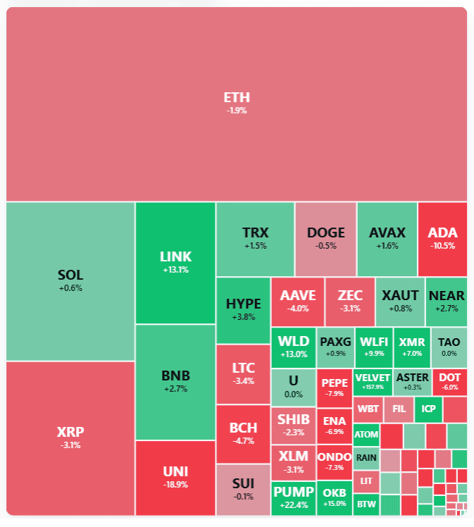
The main section displays cryptocurrencies as colored tiles.
Green indicates positive price performance.
Red indicates negative price performance.
Color intensity reflects the magnitude of the move.
The combination of tile size and color makes it possible to compare market size, trading activity, and price performance at the same time.
The heatmap is primarily a market-screening tool. First, identify a sector with broad relative strength or an asset showing unusual price action. Then move to a detailed analysis of its chart, volume, Open Interest (OI), funding rate, and key technical levels.
7. Interactive Asset Data
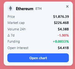
Clicking an asset opens additional market data, including:
current price;
market capitalization;
24-hour trading volume;
price change over the selected timeframe;
Funding Rate;
Open Interest (OI).
The Open Chart button provides a direct link to the selected cryptocurrency's price chart for more detailed analysis.
How to Use the Crypto Market Heatmap
The TLAP Crypto Market Heatmap is primarily a market-screening tool.
A typical workflow is:
Assess the overall market. Determine whether positive or negative price performance dominates the heatmap and evaluate the prevailing market bias.
Compare sectors. Identify sectors showing stronger or weaker relative performance than the broader market.
Find market leaders and laggards. Look for assets showing strong relative strength, unusual weakness, or outsized moves.
Compare timeframes. Determine whether the move is short-lived or supported by broader momentum.
Drill down into individual assets. Analyze the price chart, market structure, volume, Open Interest, funding rate, and key technical levels.
Build the trade setup. Use the heatmap as the first stage of the process rather than as a standalone entry signal.
Practical Trading Applications
Assessing the Broader Market
A heatmap dominated by green indicates broadly positive price performance across the selected market, while widespread red indicates broad weakness.
This provides a quick snapshot of market breadth and overall sentiment for the selected timeframe.
Finding Strong Momentum
Look for:
large-cap assets showing significant positive performance;
smaller-cap tokens posting outsized moves;
sectors where multiple tokens are moving in the same direction;
unusually high trading volume accompanying strong price action.
A single token moving sharply higher is less significant than broad participation across several assets in the same sector.
Tracking Potential Capital Rotation
Use the sector filters to monitor changes in sector leadership and potential capital rotation.
For example, relative strength may shift from large-cap assets toward Ethereum and higher-beta altcoins, or from speculative altcoins back toward Bitcoin and stablecoins.
A sector showing broad strength across multiple assets provides stronger evidence of a market-wide shift than an isolated pump in a single token.
Comparing Timeframes
Use the 1h, 24h, 7d, and 30d views to identify whether momentum is building or fading.
A token that remains green across several timeframes is showing more persistent relative strength than one that is only pumping on the 1h view.
Conversely, a short-term rally against a weak 7d or 30d trend may represent a relief bounce rather than a confirmed trend reversal.
Monitoring Market Leaders
The heatmap makes it easy to identify which assets are leading the market.
Tracking these leaders can help traders understand where momentum is concentrated and which sectors are attracting broader participation.
Important Notice
The TLAP Crypto Market Heatmap reflects current and recent market data and does not forecast future price movements.
A strong price move may reverse quickly, while a large-cap asset may move less aggressively than a smaller token.
Use the heatmap as a market-screening and sentiment-analysis tool alongside price action, market structure, volume, Open Interest, funding rates, and disciplined risk management.
The information provided is for informational purposes only and does not constitute financial or investment advice. Trading cryptocurrencies involves a high risk of loss.