
Bitcoin Rainbow Chart: How It Works, Its History, and Key Features

Rainbow Chart is a model for assessing Bitcoin's long-term value that shows how the current price relates to its historical price trend. The tool uses a logarithmic scale and color zones that help visually determine whether Bitcoin's price is within a historically low, medium, or high range.
Since late July 2026, the Rainbow Chart has been available on TLAP. It is probably one of the best versions of the indicator online.
The Rainbow Chart has gained popularity among cryptocurrency investors by clearly displaying Bitcoin's price cycles. The lower segments of the chart indicate relatively low prices compared with the long-term trend, while the upper segments indicate an elevated or extreme valuation.
However, the tool should not be used as a standalone indicator for identifying precise market entry points. Its purpose is to show the long-term context, not to predict price movements over the next few hours or days.
History of the Rainbow Chart
Development of the Rainbow Chart began in 2014, amid Bitcoin's prolonged market downturn following the collapse of the Mt. Gox exchange.
According to BlockchainCenter:
Reddit user azop began publishing charts that displayed Bitcoin's price on a logarithmic scale, divided into low- and high-valuation zones. The goal was to smooth out high volatility and analyze long-term trends.
At the same time, user trolololo proposed a logarithmic regression model for Bitcoin. It was later combined with the rainbow visualization.
Key development milestones:
2019 — the online version of the Rainbow Chart appeared on BlockchainCenter.
2020 — a surge in popularity followed Eric Wall's post about buying Bitcoin during the market recovery after the March crash.
November 2022 — the V2 version was released, incorporating a broader set of historical data (the previous model had assessed the long-term trajectory too optimistically).
2026 — a dynamic version was launched that recalculates the model using daily Bitcoin price data (since 2012) and a dynamic power-law regression method.
It is therefore more accurate to speak not of a single formula but of a class of models for long-term Bitcoin analysis that is continually being refined.
What the Rainbow Chart Shows
The core idea of the Rainbow Chart is to compare Bitcoin's current price with a long-term statistical model of price growth.
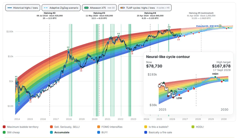
The color palette shifts from cool colors (blue and green) to warm shades (yellow, orange, and red).
The key question answered by the chart is: “How far has Bitcoin's current price deviated from the long-term historical trend?”
This distinguishes the Rainbow Chart from classic technical indicators (RSI, MACD, and moving averages), which focus on short-term dynamics.
Why the Rainbow Chart Uses a Logarithmic Scale
Bitcoin's price has ranged from nearly zero to tens of thousands of dollars, making a linear chart relatively uninformative for analyzing long-term trends.

Example: growth from 10 to 100 (10 times); growth from 10,000 to 100,000 (also 10 times).
On a linear chart, these changes would look incomparable, whereas a logarithmic scale allows multiples of price changes to be compared correctly.
Mathematically, the model can be expressed in simplified form:log(P) = f(log(t)),
where P is the price of Bitcoin and t is time.
The Rainbow Chart forms color zones around the central trajectory.
Meaning of the Color Zones on the Rainbow Chart
The specific names of the zones may differ between chart versions, so the colors should not be interpreted as universal trading signals.
Blue zones. The price is significantly below the long-term trend. Historically, these areas have appeared during deep downturns (“bear markets”) and periods of investor capitulation. For long-term investors, this may be a zone for gradual asset accumulation, but it does not guarantee that the bottom has been reached.
Green zones. The price remains relatively low or is near the lower part of the historical range. Suitable for a Dollar-Cost Averaging (DCA) strategy and building a long-term position.
Yellow zones. A neutral area: the price is close to the long-term historical trajectory. The Rainbow Chart provides no basis for claiming clear undervaluation or overvaluation.
Orange zones. The price has moved noticeably above the long-term trend, which may indicate a historically elevated valuation. Investors are advised to strengthen risk controls.
Red zones. The highest area of the model. In previous Bitcoin cycles, the upper zones coincided with periods of rapid growth and market euphoria. However, the red zone is not a signal to sell immediately — the price may continue to rise even after entering the upper part of the model.
The TLAP Rainbow Chart
The TLAP team has developed one of the most powerful rainbow charts available today.
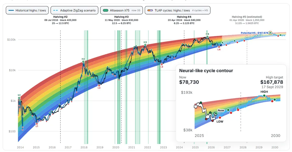
Features of the TLAP rainbow:
It is constructed strictly from five H points and five L points.
The top and bottom are two monotonic cubic curves in x=ln(days), y=log10(price): each passes exactly through all five of its anchor points.
After H5/L5, both sides continue along a common tangent, so the channel narrows smoothly and does not turn inside out after the high.
You can and should learn more about how the TLAP Rainbow Chart is structured and how it works on the indicator page.
How to Use the Rainbow Chart
Basic Operating Principles
The main purpose of the Rainbow Chart is to assess the long-term context of Bitcoin's price movement. To use the model effectively, follow this process:
Identify the current color zone. Determine which part of the “rainbow” Bitcoin's price is currently in.
Analyze historical dynamics. Examine how the price moved within the chart over previous months and years.
Consider the direction of movement. Not only the current position but also the trend plays a key role: for example, Bitcoin being in the green zone after a prolonged decline and gradually rising is a different situation from entering the green zone after a sharp collapse from the upper levels.
Analyze the Rainbow Chart dynamically — a static snapshot of the data is less informative.
Identifying the Market Cycle
One of the model's key applications is assessing the phase of Bitcoin's long-term cycle. Four stages are conventionally identified: accumulation, growth, overheating, and bear market.
Relationship with the Rainbow Chart zones:
Lower zones are relevant during the accumulation phase, where investors may look for entry points.
The middle section reflects transitional market phases.
Upper areas signal the late stages of a bullish trend.
After a sharp decline, the price may once again fall into the lower part of the “rainbow.”
Thus, the Rainbow Chart serves as a visual map of long-term cycles, helping assess the market's current phase.
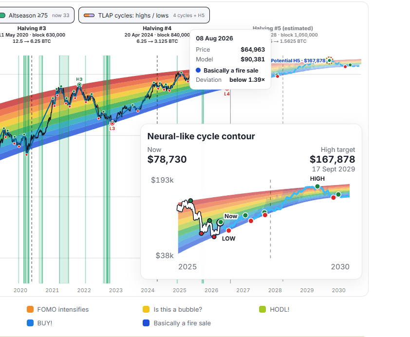
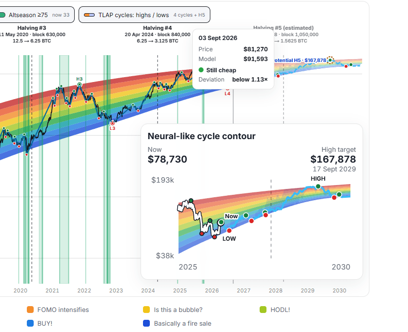
For example, below are 2 states of the TLAP Rainbow Chart: August 8 and September 6, 2026. In the first case, it is clear that the model shows the situation to be ambiguous: cryptocurrencies could have moved lower at that time.
On the second Rainbow Chart, in turn, the model produces a forecast on the basis of which an investor may consider further growth of the coin.
Integration with a DCA Strategy
The Rainbow Chart effectively complements the Dollar-Cost Averaging strategy (DCA). An investor can determine purchase amounts in advance depending on the color zone:
Blue zone: increase the purchase amount.
Light-blue zone: increase the frequency/amount of DCA purchases.
Green zone: follow the standard DCA plan.
Yellow zone: switch to a neutral mode.
Orange zone: reduce new purchases.
Red zone: begin taking some profits.
Important:
The Rainbow Chart does not dictate the investment amount — investors set the parameters themselves based on their risk profile and investment horizon, using the DCA calculator for the calculation.
The key advantage is establishing rules in advance, which reduces emotional influence during sharp price movements.
Taking Profits
Instead of searching for the “perfect top,” use the color zones to reduce the position in stages:
when moving into the orange area, begin taking partial profits;
as the price moves into the upper part of the model, increase the share of the position being closed.
Goal: minimize the risk associated with trying to predict the absolute price peak.
Using It for Shorts
Opening short positions solely because Bitcoin has entered the red zone is not recommended. Reasons:
the red zone does not guarantee an imminent trend reversal — during a strong bull market, the price may remain above the long-term trend for a long time;
additional signals are required, such as: a change in market structure; a decline in trading volume; indicator divergence; rising Open Interest amid weak price movement; a rise in the Funding Rate; increased pressure from sellers; a breakout below key support levels.
Role of the Rainbow Chart: it serves as a context filter, not as a standalone signal for entering a short position.
Combining It with Other Tools
The Rainbow Chart is most effective when combined with other methods of analysis:
Rainbow Chart + 200W MA. Comparison with the $200-week moving average helps assess the price's deviation from several long-term benchmarks.
Rainbow Chart + MVRV. MVRV (the ratio of market value to realized value) complements the model by assessing the state of the Bitcoin network.
Rainbow Chart + NUPL. The Net Unrealized Profit/Loss indicator (NUPL) strengthens signals in the upper part of the “rainbow”: extreme NUPL values when the Rainbow Chart is in a high zone are grounds for caution.
Rainbow Chart + Realized Price. Comparison with the Realized Price clarifies the extent of the market's deviation from historical levels.
Rainbow Chart + RSI. RSI adds information about short-term momentum: the combination of a high Rainbow Chart zone and an overbought RSI signals market tension.
Rainbow Chart + Open Interest / Funding Rate. For active traders, the following combination is important: Bitcoin in the upper Rainbow Chart zone; an extremely positive Funding Rate; rising Open Interest; an increase in the number of long positions. This may indicate excessive confidence among market participants and the risk of a correction.
Relationship with Halving
Halving (a reduction of the mining reward by half) is often analyzed together with the Rainbow Chart.
Historically, halvings have correlated with major market cycles. However, formulaic claims should not be relied upon, such as “after a halving, Bitcoin must enter a particular zone.” Every cycle is unique — its dynamics are influenced by liquidity, institutional investors, the state of the derivatives market, macroeconomic factors, and demand.
Thus, halving is only one additional factor in the analysis, not a basis for forecasting.
Why the Rainbow Chart Model Does Not Always Work: Limitations and Rules for Use
The Model's Main Problem
The key drawback of the Rainbow Chart is its exclusive reliance on historical data. The Bitcoin market continues to evolve as a financial asset, and future dynamics may differ significantly from past cycles.
In addition, the statistical regression underlying the model is not a fundamental valuation of the asset. It does not account for:
future demand for Bitcoin;
the amount of institutional capital that may enter the market;
changes in cryptocurrency regulation;
macroeconomic conditions and liquidity in global markets;
the transformation of the derivatives market;
potential changes in Bitcoin's volatility.
Consequently, the Rainbow Chart should be regarded as a visualization tool and statistical model, not as a method for accurately forecasting prices.
The model's developers explicitly emphasize that it is not investment advice and does not provide scientifically substantiated forecasts of future prices.
A Misconception: Model ≠ Forecast
A common mistake is to interpret Bitcoin's position in a particular zone as a signal to act.
Examples of incorrect conclusions:
entering the red zone → “the market will definitely fall”;
being in the blue zone → “Bitcoin is guaranteed to rise.”
Correct interpretation: “According to the selected long-term model, Bitcoin is in the extreme upper/lower part of its historical range.”
After that, additional factors must be analyzed rather than relying exclusively on the color zone.
Application to Risk Management
The most practical use of the Rainbow Chart is to adjust the acceptable level of risk rather than to forecast prices:
At a low valuation (blue zones): increasing the amount of new purchases is acceptable.
In the neutral zone (yellow): maintain standard exposure.
At a high valuation (orange): reduce new purchases.
At an extreme valuation (red): pay more attention to protecting profits.
This approach turns the Rainbow Chart into an element of a risk-management system rather than a standalone trading tool.
Is the Model Suitable for Intraday Trading?
The Rainbow Chart was designed to analyze long-term trends and historical cycles, not to find entry points on short timeframes (5–15 minutes).
However, the Rainbow Chart can serve as a contextual backdrop: for example, a trader who knows that Bitcoin is in an extremely high valuation zone will be more cautious about opening long positions after a strong impulse.
Integration into a Trading System
It is practical to integrate the Rainbow Chart into a three-level analysis framework:
First level (long-term context): Rainbow Chart, $200W MA, MVRV, Realized Price, NUPL. Task: assess the price's position relative to long-term benchmarks.
Second level (medium-term direction): EMA, RSI, MACD, volume, market structure. Task: determine the current trend and the strength of the movement.
Third level (entry point): Price Action, support/resistance levels, CVD, Open Interest, Funding Rate, Order Book data. Task: find the optimal moment to enter/exit.
The Rainbow Chart does not replace a trading system; it only determines how far the current price deviates from the long-term historical model.
Conclusion

One of the Rainbow Chart's key advantages is that it is relatively easy to understand. Even traders with minimal experience can quickly assess where Bitcoin's price stands relative to its historical price range.
The model also effectively “filters out” short-term market “noise,” allowing investors to focus on the asset's long-term dynamics. In addition, the Rainbow Chart provides a convenient basis for developing capital-management rules — for example, when implementing a Dollar-Cost Averaging (DCA) strategy.
At the same time, the model has several significant limitations. First and foremost, it is based exclusively on historical data, which does not guarantee accurate forecasts under changing market conditions. Differences in calculation algorithms mean that different versions of the Rainbow Chart may vary considerably in their methodology and final values.
The color zones should not be interpreted as universal benchmarks for entering or exiting positions either — they are not classic support or resistance levels. In addition, the model ignores a whole range of fundamental factors: macroeconomic trends, institutional shifts, regulatory changes, and other external conditions capable of radically affecting Bitcoin's price.
Finally, a high degree of accuracy in reproducing past cycles does not mean that the model will retain predictive power in the future. Excessive trust in the visual similarity between historical and current patterns can create false confidence in the reliability of the forecast, increasing investment risks.