
QE and the Central Bank Liquidity Gap indicator: a fundamental approach to long-term trading
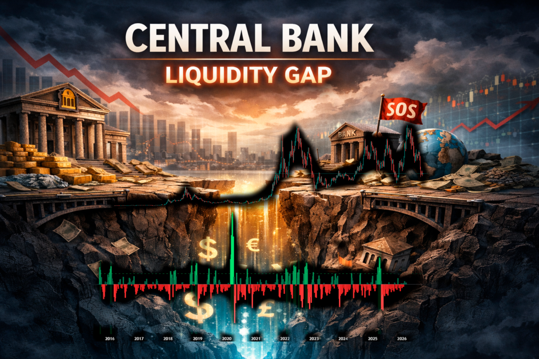
"Profits do not move the market as a whole; the Federal Reserve does that... Focus on central banks and on the movement of liquidity," Stanley Druckenmiller.
The U.S. Federal Reserve, through its quantitative easing (QE) program, directly expands its balance sheet by buying bonds and injecting trillions of dollars into the banking system. That money does not remain in reserves; to increase returns, it is directed into risk assets: stocks and cryptocurrency.
Historically, the correlation between the expansion of the Fed's balance sheet and the growth of the S&P 500 is around 0.85-0.92 during QE periods. Bitcoin's correlation is even higher: 0.95 (during the 2020-2021 liquidity expansion cycle). When the Fed winds down QE and moves to QT (quantitative tightening), the balance sheet shrinks and liquidity leaves, and markets fall.
Where can you find information about the growth of global liquidity? In the news and on central bank websites. And recently, on TradingView as well: the Central Bank Liquidity Gap Indicator appeared there and immediately made it into the Editors' picks.
Quantitative easing: how the Fed balance sheet affects the rise of stocks and crypto
What is quantitative easing (Quantitative Easing - QE)?
QE is a monetary policy under which the central bank (in the U.S., the Federal Reserve) buys huge volumes of government bonds (Treasuries), mortgage-backed securities (MBS), and other assets on the open market. The money for these purchases is created "out of thin air," as a result of which the Fed's balance sheet keeps growing.
The image below shows the growth of the global M2 money supply and the S&P 500 chart (2008-2022).
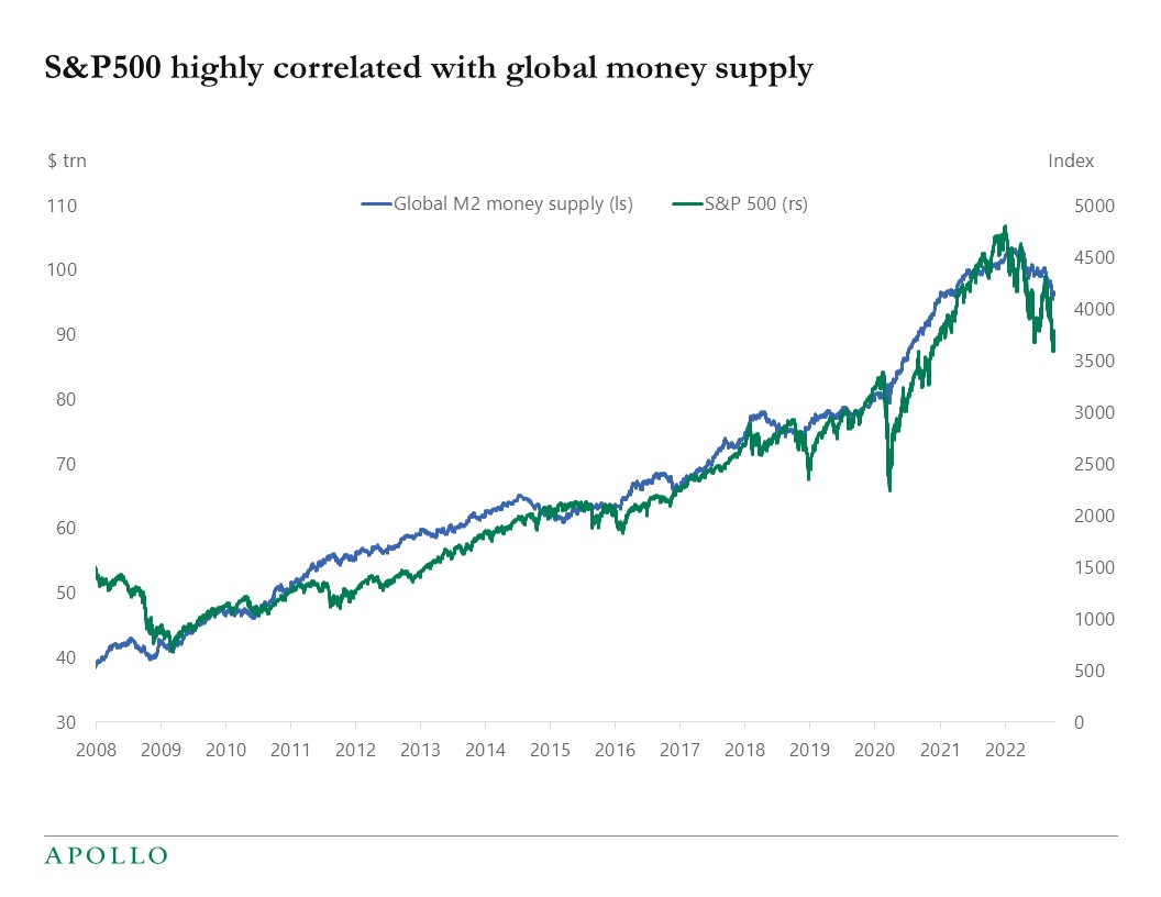
The blue line is global M2 (in trillions of dollars), the green line is the S&P 500. The correlation is almost perfect. From 2008 to 2021, global M2 grew by 140%, while the index grew by 380%. The 2020-2021 peaks coincide with the maximum liquidity injection from all major central banks. The 2022 decline was a global tightening of monetary policy.
The goals of QE are as follows:
- Lower long-term interest rates.
- Liquidity injections into the banking system.
- Support for financial markets during a crisis.
As a result of quantitative easing policy, investors and banks receive cash/reserves from the Fed and shift from safe bonds into stocks, corporate bonds, real estate, and crypto.
Thus, the main effect that quantitative easing programs have on the financial sector is the ability to rebalance the portfolio (portfolio rebalancing) followed by a search for yield (reach for yield).
The programs of the Fed, the ECB, and the Bank of Japan have the greatest impact on global markets. The Bank of Russia's program in 2020 can also be noted, as it made it possible to get through the period of COVID restrictions relatively painlessly.
A significant drawback of QE is rising consumer inflation and the financial sector's "addiction" to the flow of liquidity, which increases risk appetite and reduces control over it.
QE is often followed by a policy of QT, quantitative tightening, when the Fed withdraws liquidity from the financial system.
Timeline of the Fed's QE programs
The image below shows the relationship between the Fed's balance sheet and the value of the S&P 500.

The black line is the Fed's balance sheet in billions, the blue line is the S&P 500. The vertical bands of QE1 (2008-2010), QE2 (2010-2011), QE3 (2012-2014), then Euro-QE and COVID-QE are clearly visible.
Each new round of QE was accompanied by a sharp rise in the index. This was especially evident in 2020: the balance sheet increased by $4.7 trillion in just one year, and the S&P rose by 70% from the lows. The red dashed line shows the liquidity withdrawal schedule. As soon as the Fed announced a reduction in purchases, the market corrected.
QE1 (November 2008 - March 2010)
- Purchases: $1.25 trillion in MBS + Treasuries + agency debt.
- The Fed's balance sheet grew from ~$0.9 trillion to ~$2.3 trillion.
- S&P 500: from the low of 666 points (March 2009), it rose by 95% by March 2010.
- This saved the market after the collapse of Lehman Brothers.
QE2 (November 2010 — June 2011)
- $600 billion in long-term Treasuries.
- Balance sheet → ~$2.9 trillion.
- S&P 500 +25–30% over the period.
Operation Twist (September 2011 — December 2012)
- Not classic QE, but a "twist": selling short-term Treasuries and buying long-term ones (reallocation).
- It additionally supported the rally.
QE3 (September 2012 — October 2014)
- $85 billion per month ($40 billion MBS + $45 billion Treasuries).
- The balance sheet grew to a record-high at that time of ~$4.5 trillion.
- S&P 500: from 1400 to 2000+ points (+43%).
- The longest program before the pandemic.
COVID-QE / QE4 (March 2020 — March 2022)
- The largest-scale one: "in the necessary volumes."
- Purchases: first $500 billion in Treasuries + $200 billion in MBS, then $120 billion/month, then an open-ended mode.
- The balance sheet soared from $4.2 trillion to a peak of $8.9–9.0 trillion in 2022.
- S&P 500: from 2237 (March 23, 2020) to 4818 (January 2022) = +115% in just 22 months.
- Nasdaq and especially crypto rose even more strongly (BTC +1700%).
QT (2022 — December 2025)
- A reduction of the balance sheet by ~$2.3 trillion.
- The S&P 500 fell by 25% in 2022, then recovered, but growth was weaker than during QE.
From December 2025 to the present time (March 2026)
QT officially ended in December 2025. The Fed is now conducting Reserve Management Purchases (purchases of short-term T-bills) - this is effectively an extremely soft QE to maintain excess reserves (about $6.6 trillion) in case a crisis arises. These funds are more or less enough to support the stock market, but completely insufficient to keep cryptocurrency from collapsing by almost 50%.
The growth of the Fed's balance sheet and those of other global central banks affects not only the stock market, but also the cryptocurrency market. By the way, the cryptocurrency market appeared when the first QE program was launched, and there is an opinion that cryptocurrencies were conceived in part to absorb excess money supply.
The image below shows the correlation between the Fed's balance sheet and the price of Bitcoin from 2011 to 2024 with a projection.
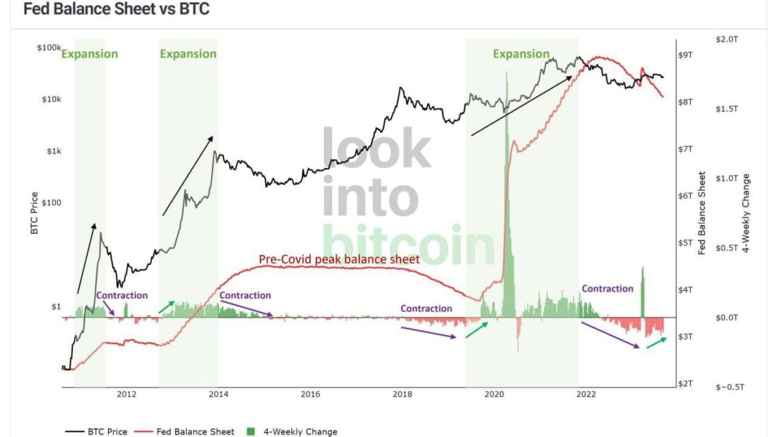
The black line is BTC (logarithmic scale), the red line is the Fed's balance sheet. The three previous cycles of Fed balance-sheet expansion perfectly preceded BTC bull runs:
- 2012–2013: balance sheet +$2 trillion → BTC from 5 to $1200 (+23,900%)
- 2016–2018: stabilization + growth → BTC from 600 to $20,000
- 2020–2021: +$4.7 trillion → BTC from 3800 to $69,000 (+1715%)
And here is the result of the 2022–2023 quantitative tightening, QT: the balance sheet declines by $2.3 trillion, and BTC falls by 77% from the peak.
And finally, the most interesting part.
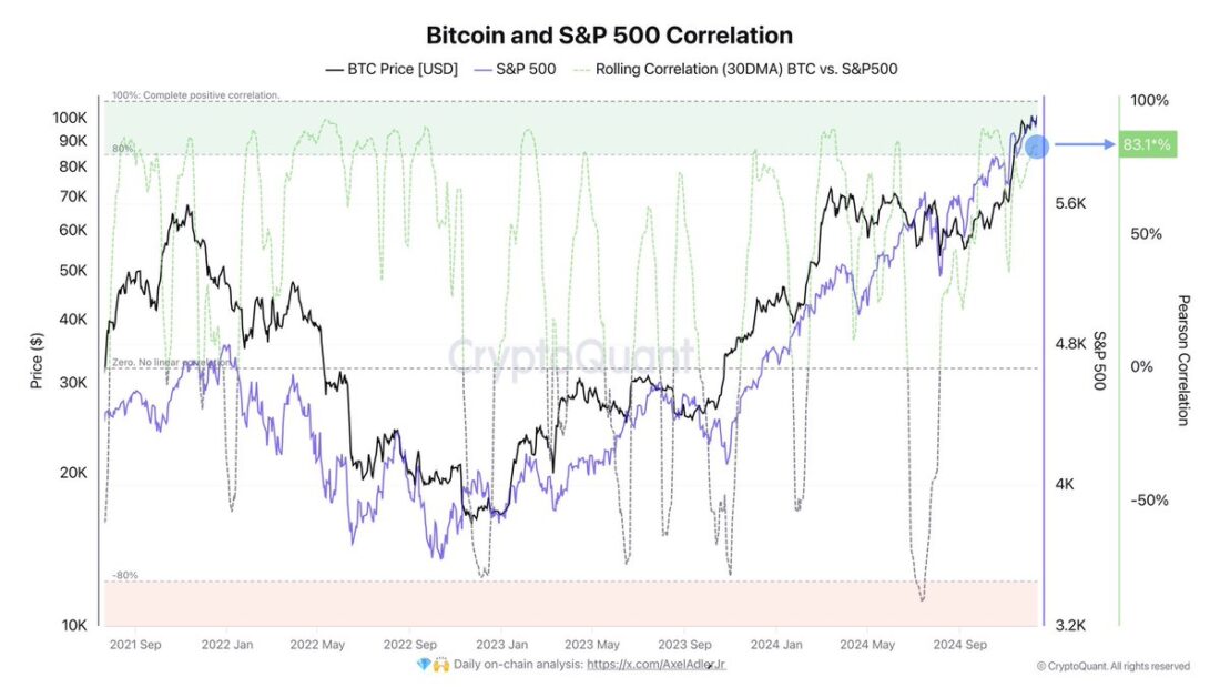
There is a strong correlation between BTC and the S&P 500. Not twins, but fairly close relatives. And both assets depend on the liquidity of the Fed and other global central banks. At the same time, stocks often start rising earlier than crypto, while crypto starts falling earlier than the stock market. That is, the hottest money goes into crypto.
Why Did Stocks and Crypto Rise in 2025?
There are many reasons: liquidity left over after all the QE programs that needed to be parked somewhere, some enthusiasm about Trump, expectations of rate cuts, and even expectations of the launch of another QE.
As for crypto, a lot of helicopter money from retail participants came here, and that also could not help but affect the rise.
That is, we can say that the last wave of growth was detached from the current state of the Fed's balance sheet, but at the same time the growth was supported by the liquidity injected into the financial system in previous years.
Central Bank Liquidity Gap Indicator
The Central Bank Liquidity Gap Indicator (Central Bank Liquidity Gap Indicator) was developed by the author HenriqueCentieiro. He has only 1.3 thousand followers and 34 scripts in his TradingView portfolio. All of the indicators are more for advanced traders than for beginners.

The Central Bank Liquidity Gap indicator was released in early February 2026 and was featured by the TradingView editors two weeks later.
According to the author, the indicator measures the gap between the growth of global liquidity and the growth of the stock market. This makes it possible to identify the potential time and place for long-term buying.
Above we already showed that liquidity drives markets: some time passes between the start of QE or similar programs and the inflow of money into the stock or cryptocurrency market.
The indicator makes it possible to see time periods when liquidity growth is ahead of market growth. This gives an excellent opportunity to enter the market while there is still a mismatch with the new money supply volume.
How the Central Bank Liquidity Gap Indicator works
The indicator calculates a simple divergence:
Divergence = % liquidity growth − % S&P 500 growth
- Green bars = liquidity is growing faster than the market (bullish signal)
- Red bars = the market is growing faster than liquidity (less bullish)
Multi-Country M2 Money Supply
The indicator uses M2 money supply (more details here) from different countries, which makes it possible to combine money supply data from several economies: the US, the UK, Canada, China, the Eurozone, Switzerland, Japan, and India.
Each M2 is automatically weighted by the real size of the economy (in USD). Larger economies have greater weight. For China, the weight is reduced by 50% because of capital controls, which limit the flow of Chinese liquidity into global and American markets.
Fed Net Liquidity
You can add total Fed liquidity for a more accurate assessment of American liquidity:
Net Liquidity = Fed Balance Sheet − US Treasury Account (TGA) − Reverse Repo (RRP)
This reflects the real liquidity that the Fed injected into the financial markets, rather than just the broad money supply.
How to read the indicator
Buy zone (divergence +5 % and above). When the divergence exceeds +5%, the indicator enters the Buy Zone (highlighted with a green background). This means that liquidity is significantly ahead of market growth, which is historically a strong buy signal.
Information table shows:
- Component weights (how much M2 each country contributes)
- Corr w/ SPX — the current correlation of liquidity with the S&P 500
- Leads SPX by X — how much past liquidity predicts future SPX movements
- Divergence % — the current divergence value
- Signal
Correlation statistics
- Corr w/ SPX: shows whether liquidity and the market are currently moving in sync
- Leads SPX: shows how much liquidity changes predict future SPX movements (a positive value means liquidity is a leading indicator)
Indicator settings
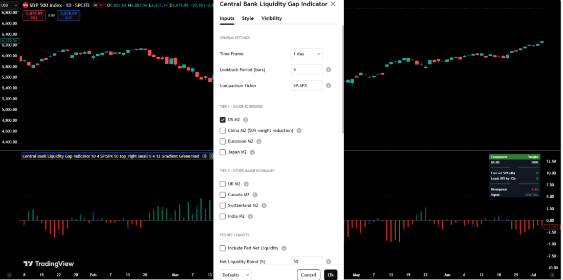
Time frame: choose the day as the smallest time frame.
Lookback period: the standard is 4. Fewer points, but they are the very best.
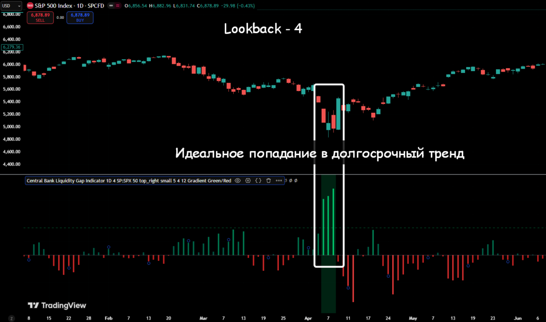
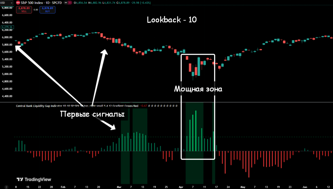
If you set a larger lookback (10 in the example above), the indicator shows more opportunities, but given that this is a long-term indicator of future movements, many signals may be too early.
Tier 1 / Tier 2 means selecting the M2 of different countries. It works well with the instruments of the countries included in the list.
Show buy zone (buy threshold %) defaults to "5." If increased to "10," you can track only the most key points. They are visible on the chart anyway, but perhaps someone will find it more convenient as a strip.
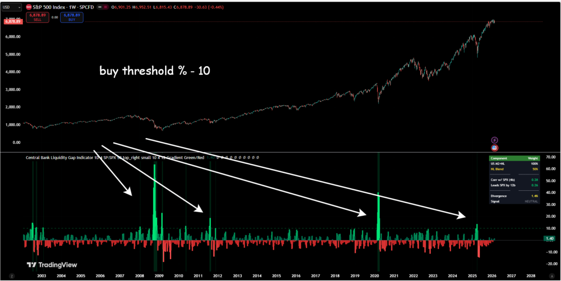
In addition, "10" shows the moments when QE programs are launched or when there are sharp changes in global trade, such as Trump's tariffs in 2025.
The indicator works perfectly in the stock market and shows the time frames when a reversal to the upside may begin.
Testing the Indicator on BTC and ETH
We have already shown above that BTC is, in a sense, a derivative of the S&P 500.
The strategy for applying the indicator to BTC is a bit more complicated.
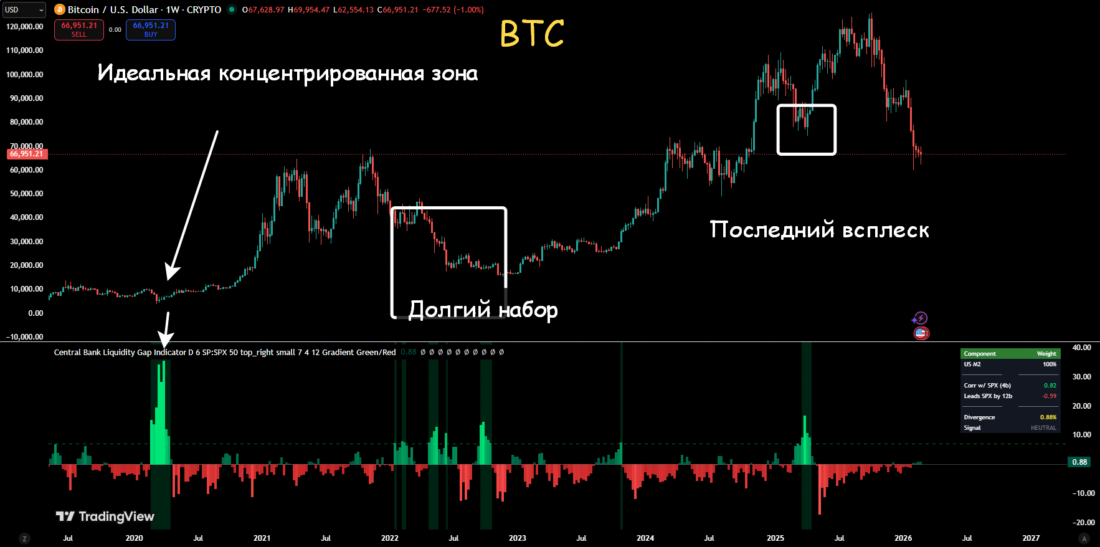
I tried keeping SPX (S&P 500) as the comparison ticker and replacing it with BTC.
Here is what came out. A weekly BTC chart starting from 2020.
Settings: comparison ticker SPX, lookback period 6, buy threshold % 7.
Now let us evaluate the BTC chart if you set BTC as the comparison ticker in the indicator settings.
The picture is much worse here. The lookback needs to be increased to at least 20. But even in that case, the indicator shows many premature and therefore unreliable signals.
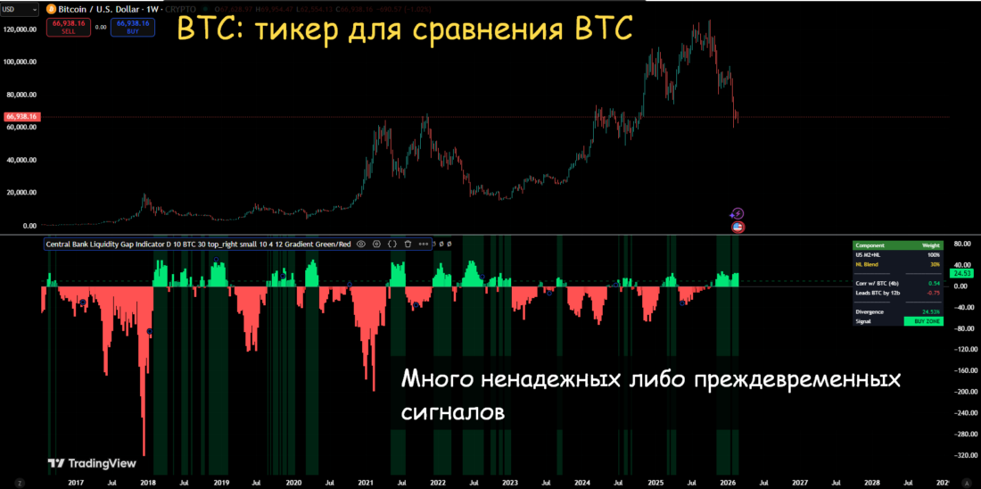
Therefore, it is better to leave SPX as the comparison ticker in the settings.
Here is a check of the standard settings on the weekly ETH chart. The indicator shows long-term market entry points very well, but only if SPX is selected as the comparison ticker.
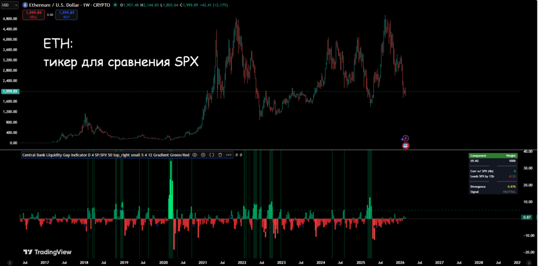
Why can you not use a cryptocurrency as the comparison ticker?
Let us recall the indicator calculation formula, where the divisor is the "% growth of the S&P 500." The growth rate of the S&P 500, measured in tens of percent, is much more aligned with the growth rate of the money supply, whereas the growth rate of BTC/ETH means doubling or tripling growth.
Possible Usage Scenarios
- Long-term investing: wait for a divergence of +5% and above to accumulate index funds, ETFs, or stocks. For cryptocurrencies, divergence is +7%.
- Cryptocurrency: Bitcoin and crypto markets also correlate strongly with global liquidity.
- Risk management: do not add positions when the divergence is deeply negative.
Conclusion
The Fed balance sheet and global liquidity are the number one fundamental driver of growth in the stock and cryptocurrency markets.
Growth of the Fed balance sheet (QE) is usually associated with increased liquidity in the financial system, lower bond yields and borrowing rates, which often contributes to growth in the stock market and cryptocurrencies. Reduction of the balance sheet (QT) decreases liquidity and can increase pressure on stocks and cryptocurrencies, although this effect is not always direct or guaranteed.
The Central Bank Liquidity Gap indicator on TradingView shows moments when there is a divergence between the growth of the global M2 money supply and the growth of the stock and cryptocurrency market. This opens up colossal opportunities for long-term trading.
If the current divergence on the indicator is above 5-7%, it is time to accumulate SPY, QQQ, BTC and ETH. For aggressive investors, leverage in the buy zone is acceptable, but with the understanding that risks must be assessed on the daily and weekly timeframes.
The Central Bank Liquidity Gap indicator does not provide exact bottom timing, but it shows the window of opportunity very well, especially at divergence values of +15% and higher.