
Forget ATR: How and Why to Calculate Timeframe Ranges

One of the most important parameters in the quantitative and qualitative analysis of a trading instrument is volatility, i.e., the range of movement. A simple derivative of volatility is the average range, or the probabilistic path of the quote.
Why are volatility parameters calculated? In a broad sense, to make trading predictable. Understanding the probabilistic path makes it possible not only to determine R:R, but also to clearly understand what distance the quote can still travel within a session / day / week.
In the article below, we will look at the specifics of accounting for working ranges and applying this knowledge in intraday and intraweek trading.
How to Calculate the Ranges of the Selected Timeframe
There are several methods for calculating ranges and extracting trading-important parameters from this data.
If you do not feel like calculating or reading further, you can simply install the ATR indicator, which is standard on all trading platforms. The indicator makes it possible to quickly get an idea of the average range values characteristic of the instrument being considered. The indicator also helps determine whether volatility is increasing or decreasing.

But ATR, in my personal opinion, is completely unsuitable for finding trading opportunities here and now. The quantitative (statistical) method is suitable for these purposes instead. What is it? Let us figure it out.
The quantitative method implies, first of all, collecting high / low values for the period of interest to us and then calculating the difference between the maximum and minimum price as a simple arithmetic absolute value.
After carrying out the above procedure, we will obtain the most important thing: the timeframe range.
Why is there no point in looking at open / close ranges, etc.? Because these ranges often do not carry substantial information for current trading within the timeframe.
Let us imagine a simple situation: the high / low range is 300 ticks, while open / close is 10 ticks. And what do we do with that? Look at a specific candle and search for a candlestick pattern? Study the volume model (in my view, that is a solution, but just not for statistics)?
But knowing that the average movement range is 300 ticks gives us an understanding that the quote made a standard move within the session in both directions. Market participants did not go beyond the bounds of average probabilities.
In general, we are interested in the maximum and minimum prices for calculating ranges.
Where to Get Data for Analysis
To my surprise, not many terminals have statistical modules that make it possible to process data in one form or another.
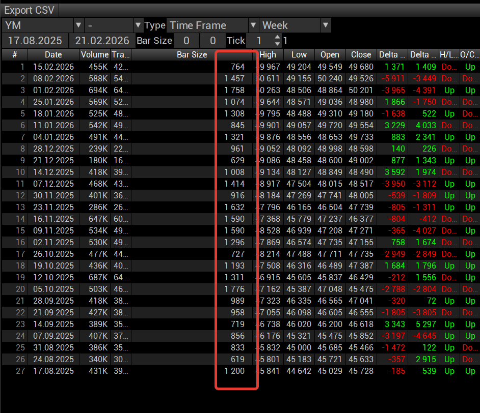
Personally, I use the statistical module in the VolFix terminal:
But there are more accessible and free options for traders who are ready to work with Excel tables to create their own adequate trading strategy that takes market realities into account.
These solutions are the well-known MT4 / MT5 terminals. One of the non-obvious advantages of these terminals is the presence of a quote archive and the ability to export it. You can read about how to download data at these links: data export in MT4 and MT5.
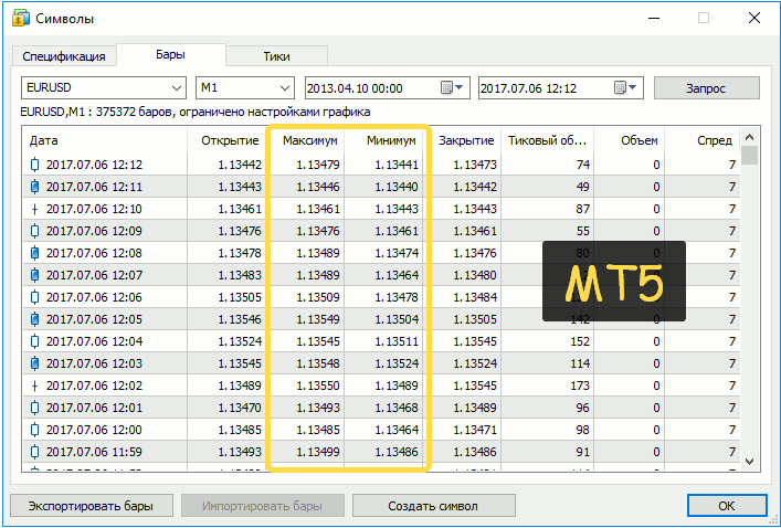
To work in Excel or a similar program (for example, the professional statistical package Statistica or Google Sheets), you need to export .csv files. Search for the query "how to open csv in excel as a table" to learn how to open files of this format correctly. You can also refine your search to learn how to use formulas (calculating the median, quartiles, minimum, and maximum) to obtain calculated range data and how to build charts and graphs in Excel.
Instead of Excel / Statistica, you can load the data into almost any neural network, and it will tell you what and how. But for that, you need to know what to ask about. And that is also a separate art that requires understanding what you are asking about.
Algorithm for Calculating Ranges
And now let us move on to the actual calculation of ranges.
First of all, we choose the working timeframe. Most of us either work intraday or hold swing positions for 2–5 days.
Which timeframe should you choose? Regardless of the type of trading (from scalping to swing), you need to have statistics on the ranges of the weekly and daily (session) timeframes at hand.
The logic here is very simple. If over two or three days the quote has passed the expected probabilistic range of movement and is near one of the range boundaries, then it is reasonable to look for reversal patterns: both in medium-term swing trading and in intraday scalping (not to be confused with HFT).
An attentive reader may immediately ask: why do we need to know the average range if the quote is near the boundaries of consolidation? Here it is enough to look at oscillators, candles, or anything else.
That is all correct. But the average expected move of the week may be reached, for example, somewhere in the middle of the two-month consolidation range on the first trading day. And what then: wait for a further move or look for reversal patterns? The question is nontrivial.
To answer these and other questions, it is necessary to show the process itself.
To do this, we will analyze the YM instrument, the American session (08:30 – 15:15 CT), 65 sessions (19/08/2025 – 20/02/2026).
After obtaining the raw data, we build the simplest linear distribution chart, for clarity.
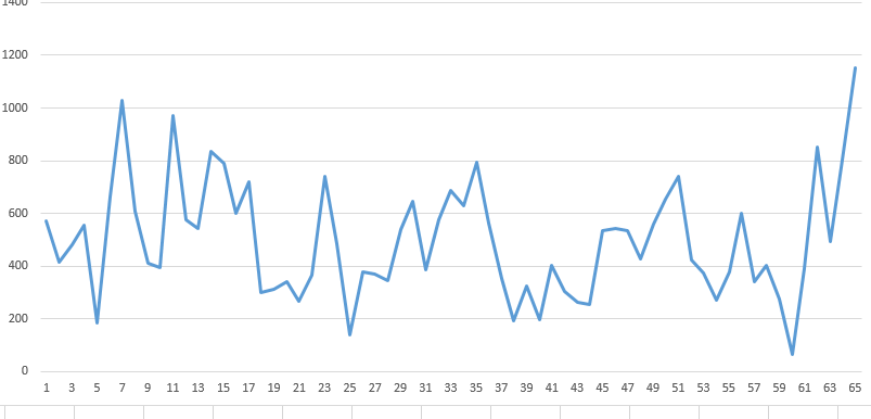
The chart produced some kind of squiggle that, at first glance, seems to say nothing. But if we dig a little deeper, we will see the classic picture of oscillation, that is, the repeated movement of an object around a central stable position (equilibrium). This definition comes from physics, but I like it in the market context as well.
On the chart we see several sharp peaks (about 7) and several declines with dampings (about 25), that is, the data are unstable and have pronounced fluctuations. Ideally, it is even possible to know the probabilities of new peaks appearing after dampings, but I do not know how to do that; serious mathematical training is needed here.
But even by eye, one can estimate the following: if there is a significant increase in range (the movement range is closer to the 4th quartile, more on that below) in one session with a subsequent insignificant decline, then an increase in range is likely in the next session (the third one in sequence).
This logic works on this instrument from August 2025 to February 2026. In fact, it works on all instruments.
For this understanding alone, it is worth calculating timeframe ranges, since an intuitive yet real-process-based way of identifying days interesting for trading appears.
Basic Statistical Metrics
The next steps within the proposed method are to find the basic statistical metrics:
- Median (divides the sample into two equal parts; it is usually close to the mean, but there are cases of strong skew: for example, 10 values in a 10-tick range and 1 value in a 50-tick range, then the mean is 13.63, while the median is 10).
- Quartile (25%, 50%, 75% of the sample values).
- Decile (the first and last 10% of values).
- Minimum and maximum values (extreme movement values, much smaller or larger than which movements should not be expected).
Let me remind you that answers on how to calculate these metrics in Excel can be found through search. I use the basic functions of the Statistica package, in which I will perform the main calculations.
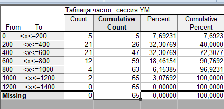
Below is a frequency table (a method of presenting data in which, for each possible value or range of values within specified boundaries, it is indicated how many times it appears in the sample):
Now the same thing, but in the form of a histogram:
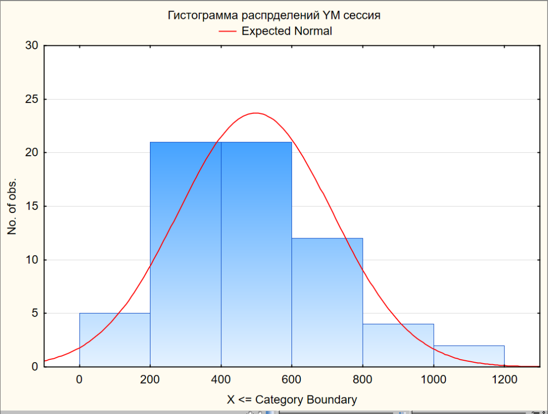
A bit of data analysis (let me remind you that the sample is 65 sessions).
7.7% of sessions have a movement range of up to 200 ticks. 32.3% (21 times) are from 200 to 400, and the same number are from 400 to 600 ticks: in total, this is 65% of sessions. More than 600 ticks is just under 28% of sessions.
At a tick price of $5, the instrument becomes interesting for further analysis.
The frequency table and the frequency distribution chart are rather raw data that visualize the first linear chart from another angle.
Now let us move on to the statistical metrics themselves.
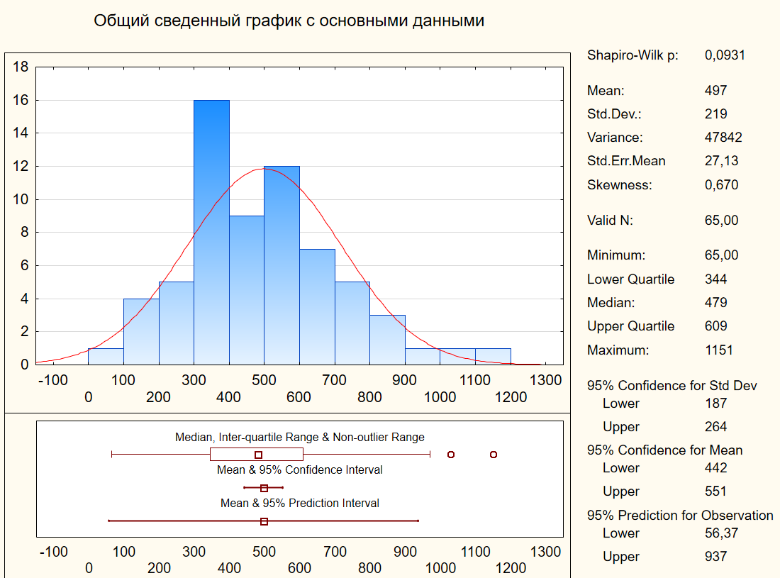

The median, which divides the sample into 2 equal parts, is 487 points. For convenience, let us take the value 500.
At the same time, the lower quartile (25% of sessions with the smallest range) is values below 344 ticks (let it be 350). What does this mean in practice? One out of four sessions has a range of less than 350 ticks. Trading in it is not interesting, but it can be very calm (not always).
Separately, let us note that the bottom 10% of sessions are less than 263 ticks (let it be 250 for convenience). And that is every tenth one. Not so sad anymore.
The minimum is 65, but that was some kind of weekend day. Strictly speaking, weekend sessions should be excluded from the calculations.
50% of sessions (from 25% to 50%) are 350-610 ticks. At the same time, the median is 500. It turns out that there is some bias toward the expected session range of 350-500, but overall up to 600. And this is every second session.
And further on it is similar. Every fourth session has a move from 610 to 1150 ticks. At the same time, the upper 10% start from 795 ticks. That is, we will more often see about 500-800, and that is 40% of sessions, which amounts to 8 sessions out of 20. And 20 sessions are already a whole month.
Let us collect the main important data in a table:
| Column 1 | Column 2 |
|---|---|
| 50% of sessions (from the lower 25% to the upper 75% of values) | 350-610 ticks |
| Median (middle) | 500 ticks |
| 40% of sessions (from 50% to 90% of values) | 500-800 ticks |
Now we have some data, but how do we apply it in practice? Read on.
A practical example of using range statistics
As an example, let us examine the RTH session on Tuesday, February 24 (YM instrument).
In the first half hour (the initial balance, IB), or rather in the first 20 minutes, the quote ran 511 ticks, that is, half the range of the previous session (991 ticks).
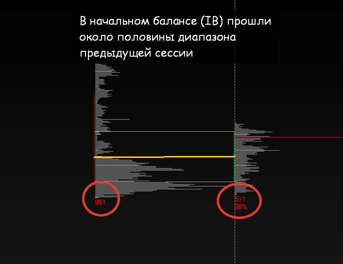
511 ticks is simply the median session move, but by no means the initial balance, let alone the first 20 minutes.
Under such conditions, expecting a powerful pullback is quite reasonable, especially if certain conditions are met: reaching a significant zone that within any type of analysis can become resistance. In our case, the movement under discussion reached the low of the previous week, an obvious (both to a novice trader and to a powerful advanced trading robot) point for looking for resistance.
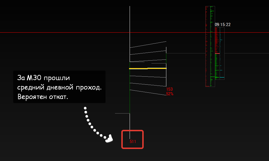
In addition, we remember that a peak session is most often followed by a session with a smaller range, and 991 ticks on Monday is a confident hit in the top 10 sessions. One can, of course, wait for an even greater range expansion, but that is already force majeure, not statistical probability.
Overall, taking into account all the designated parameters and working only with the ranges of probabilistic moves, one can expect a quick and strong correction.
After signs of a transition to short appeared (a break of local support with imbalance on declining volumes), a trade was opened with a target at VWAP. Moved to break-even after 2 minutes.
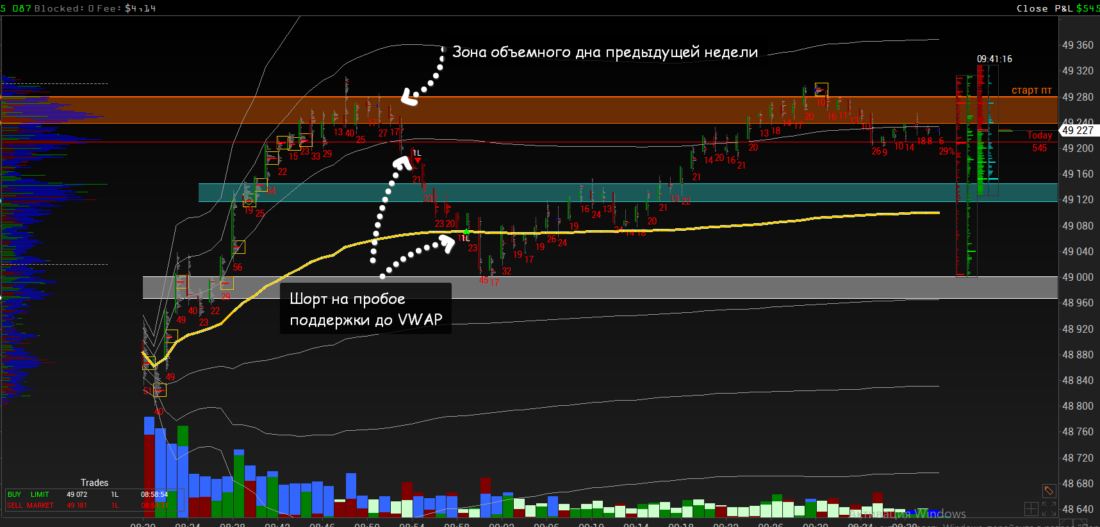
The trade lasted 4 minutes 23 seconds and brought 109 points of profit. And then it was already another story.
By the way, the entire session range amounted to 543 points, of which 511 were covered in the first half hour.
Timeframe nesting: analysis of weekly range data
And now the question: could one have expected a buy session on February 24 after a short session on February 23, having only the weekly probabilistic move data on hand?
Here is the table with weekly ranges for the period under consideration:
991 ticks on Monday, February 23, is very close to the median (everyone can calculate it for themselves) of the weekly moves.
In practice, we see the same thing we talked about above. If in the initial balance (the first 20 minutes of the RTH session) the median move of all sessions was covered, then on the first day of the week the median weekly move was covered.
This means that simply by knowing the probabilistic ranges and understanding the logic of the market auction, one could expect a correction (pullback). At the same time, continuation is also possible, but it is a statistically less probable event given the timing.
Once again I repeat: in another market phase there may be continuation and even a strengthening of momentum, but statistics as a whole is a stubborn thing, which means that first of all one must assess the probability of the event.
Then the question arises: why, understanding the probability of a pullback on Tuesday, February 24, did we not buy? The answer is simple.
The pullback could have played out in different ways: both with an extension of the lows by 50-100 ticks and with calm trading closer to the February 23 lows with a sharp spike after lunch. Therefore, it was worth waiting for the initial balance to develop and finding your trade.
Do You Need a Volume Terminal to Analyze Ranges? No
Range calculations can be done for any TF (from seconds to hours). The logic is this: there is a session range, it was covered in half an hour, and during the move the minute ranges were elevated, which means we are likely to see a correction rather than a reversal. Not an ironclad rule, but it gives you something to think about. And no indicators are needed.
We saw a pullback and opened a scalping trade, focusing primarily on the probabilities associated with normal ranges. Or, if we are confident that the session is impulsive, we wait for the pullback to end and enter.
To use ranges, it is not necessary to have volume terminals. You can use any indicator system to find reversals (for example, the supertrend on the minute TF, available on TradingView).
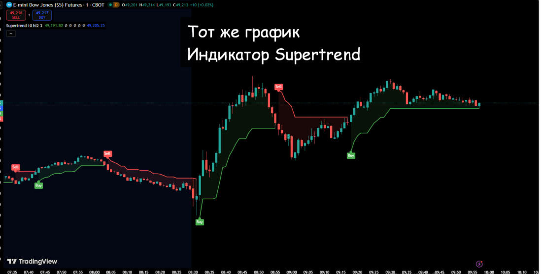
Volume models and knowledge of probabilistic ranges allowed us to see the corrective entry a little earlier. However, with stricter settings of the Supertrend indicator, you can get a slightly better entry.
Conclusion
And finally, one small tip. It is better to calculate day / session ranges for a year and build a line chart based on these values.
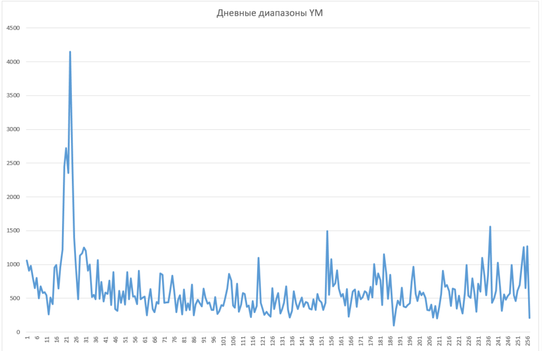
During this time, there is a probability of a change in participant activity. This can be seen in different parameters, one of which is the probabilistic move.
At the same time, it is also clear that the minimum moves do not shift much, and the maximum ones (not extreme, that is, excluding the maximum 10% of sessions) also generally remain at similar values. But the distribution within the boundaries clearly changes, as in our case. And this can and should be worked with.
Thus, having such a chart, you can identify a change in activity fairly quickly, albeit with some delay, which will make it possible to adapt trade parameters (s/l and t/p).
Collecting statistical metrics makes trading not blind indicator-following, but routine work tied to probabilities. In our case, working with probabilities is more intuitive, but with sufficient skill it is not so difficult to add statistical parameters of the move range to the algorithm and build some kind of probabilistic predictive model on that basis.
Accounting for probabilistic moves and understanding timing will help properly assess the potential of the trade signaled by the trend indicator.