
Technical Analysis in Forex

Hello, trader friends!
They say history moves in a spiral and all events in history repeat themselves. Is that really so? Today the topic of our lesson will be the use of technical analysis in forex trading.
Technical analysis is the ability to forecast price movement based solely on the analysis of the historical movement of the price chart. The history taught at school is speculative; the history of prices is an absolute postulate.
Price movement in forex is formed by a wide variety of numerous factors. It is impossible to embrace them all together even for the most sophisticated professional. No trader is capable of analyzing every trade taking place in the forex market. Based on this, trading periods are divided into equal timeframes, time intervals within which not every trade price is analyzed, but only the five most significant ones: the opening of the trading period, the closing of the trading period, the low of the period, the high of the period, as well as volume.
From the above, we come to the conclusion: technical analysis processes only 5 numbers. All trading systems, chart patterns, and indicators are their derivatives.
The Unbreakable Rules of Technical Analysis

Prices Discount Everything
Numerous factors from the outside world ultimately affect price and, in the end, influence the result, the price chart. In modern trading, there is practically no time difference between a news event and its consequence, the price reaction to it. A trader who uses technical analysis in trading assumes that there is no need at all to analyze incoming news. Only historical price values matter. That is enough for a trader to make a profitable trading transaction.
Prices Obey Trends
The market is always in motion, prices move down or up. Between price moves, the market is in a flat state, nondirectional sideways movement.
History Repeats Itself
The market's reaction to certain situations in the past and the market's movement relative to those reactions will be similar in the future.
It is believed that Charles Dow was the founder of technical analysis. In his works, he set out certain rules thanks to which trading operations can be carried out with the least risks.
Representing Price Data
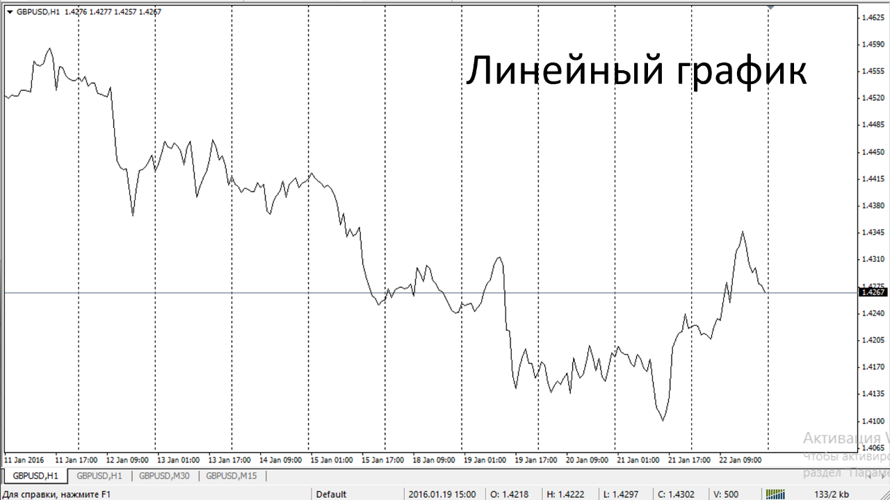
The totality of all information about trades can be displayed on a chart by a line, and the points forming this line will represent data about each completed trading operation. Such a chart would be called a line chart, but if we take the time interval into account, then this chart would be called a tick chart.
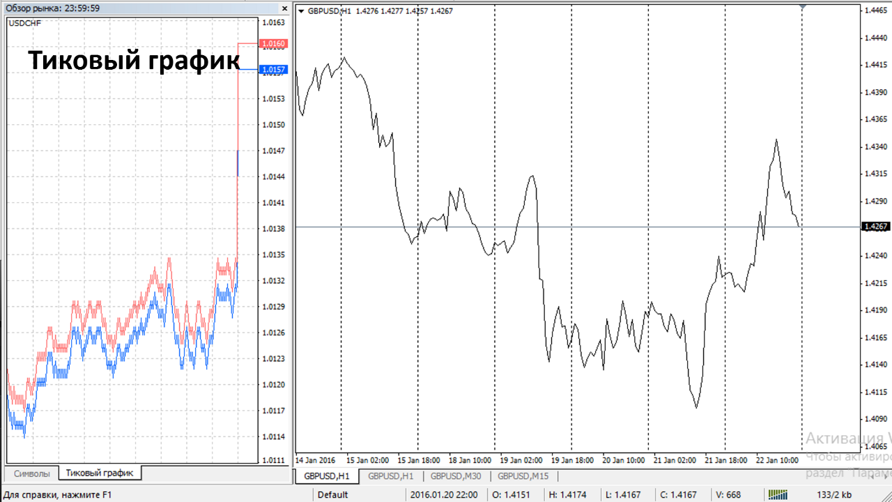
Tick chart is a type of special chart that contains information about all completed trades for a trading instrument. From the standpoint of the depth of displaying the entire array of trade data, the tick chart is the most detailed. The possibilities for analyzing a tick chart are significantly limited, especially if it displays liquid trading instruments. The volume of trades on a tick chart can amount to tens and hundreds of thousands per day. Data volumes on such a scale are difficult to process even with the use of supercomputers. At the same time, information for using technical analysis becomes extremely redundant for tick charts. To speed up information processing, it was decided to plot price and volume data not for each trade, but in aggregate, as a total result, and tie it to a certain period of time, a timeframe.
Timeframe is a time interval divided into segments of equal duration. Each time segment contains 5 main values: the price at the beginning of the time segment, the price at the end of the time segment, the minimum price reached in the given time segment, the maximum price reached in the given time segment, and volume.

Initially, line charts were used in the analysis of trading instruments. In a line chart, it is impossible to display the minimum and maximum price reached within a given time segment. That is why traders began to use charts built with Japanese candlesticks.
Japanese candlesticks are the universally recognized global standard for displaying price dynamics on a chart. To build a Japanese candlestick, we need 4 points: we connect with a line the highs and lows reached by price over the timeframe under consideration, draw a rectangle from the opening price of the period to the closing price, shaded or empty. If the price rose, our rectangle will be empty; if the price fell, it will be shaded. Rectangle is the candlestick body. The line between the high and the low is called the "candle shadow" or "spikes".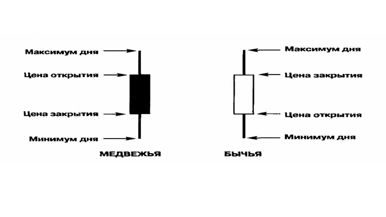
Volume charts are most often built below the price chart and are displayed in the form of bars, one for each candlestick and tied to it.

In technical analysis, the most common timeframes are the following: 1 min (M1), 5 min (M5), 15 min (M15), 30 min (M30), 1 hour (H1), 4 hours (H4), day (D1), week (W1), month (MN).
Almost all trading platforms support these timeframes, and the majority of trading systems operate precisely on these timeframes.
The choice of timeframe is strictly individual. A timeframe usually depends on the pace of trading and also determines the trader's involvement in trading. The image on the screen shows charts of the same instrument, but for different timeframes. On the daily chart, a rising candle is shown. This chart will not allow a single trade to be made during the trading day. But on the 30 min timeframe, we see an uptrend with all its inherent elements, trading on which we can make trades during the day.
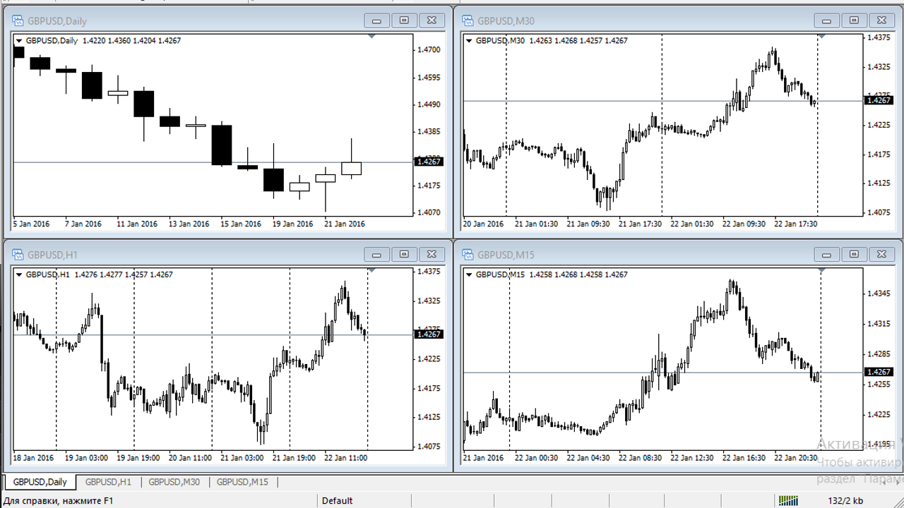
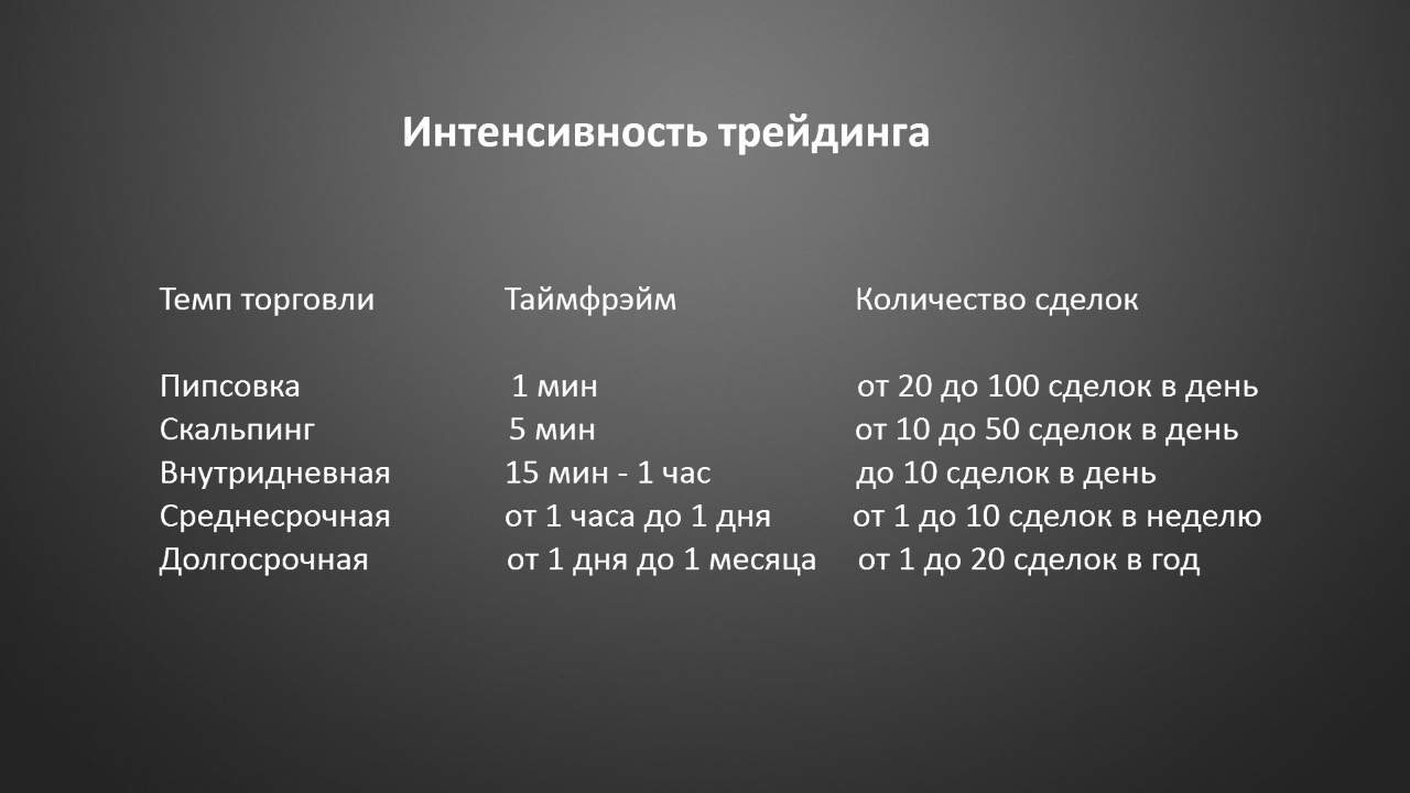
Trading intensity and timeframes are shown in the table below.
Rules for working with a timeframe
Rule No. 1 Track every new candle. That is, for a 30 min timeframe, you need to watch the terminal once every 30 minutes; for a 1 hour timeframe, once every hour.
Rule No. 2 When using trading systems for, for example, 1 hour, you must stay strictly on this timeframe; if you move to higher or lower timeframes, your trading system may stop working.
Market movement

The market is constantly moving in some direction. The direction of movement is determined by the sentiment of market participants. The state of the market is determined by two phases: there is a trend (upward or downward) and there is no trend (flat)
Types of trends
Uptrend - is formed by an alternation of several local highs. Each next high must necessarily be higher than the previous one. There is also a series of lows, each next one higher than the previous. The inability of prices to break the last high indicates a weakening of the trend and warns of its end. A fall below the last low suggests the beginning of a possible trend reversal.
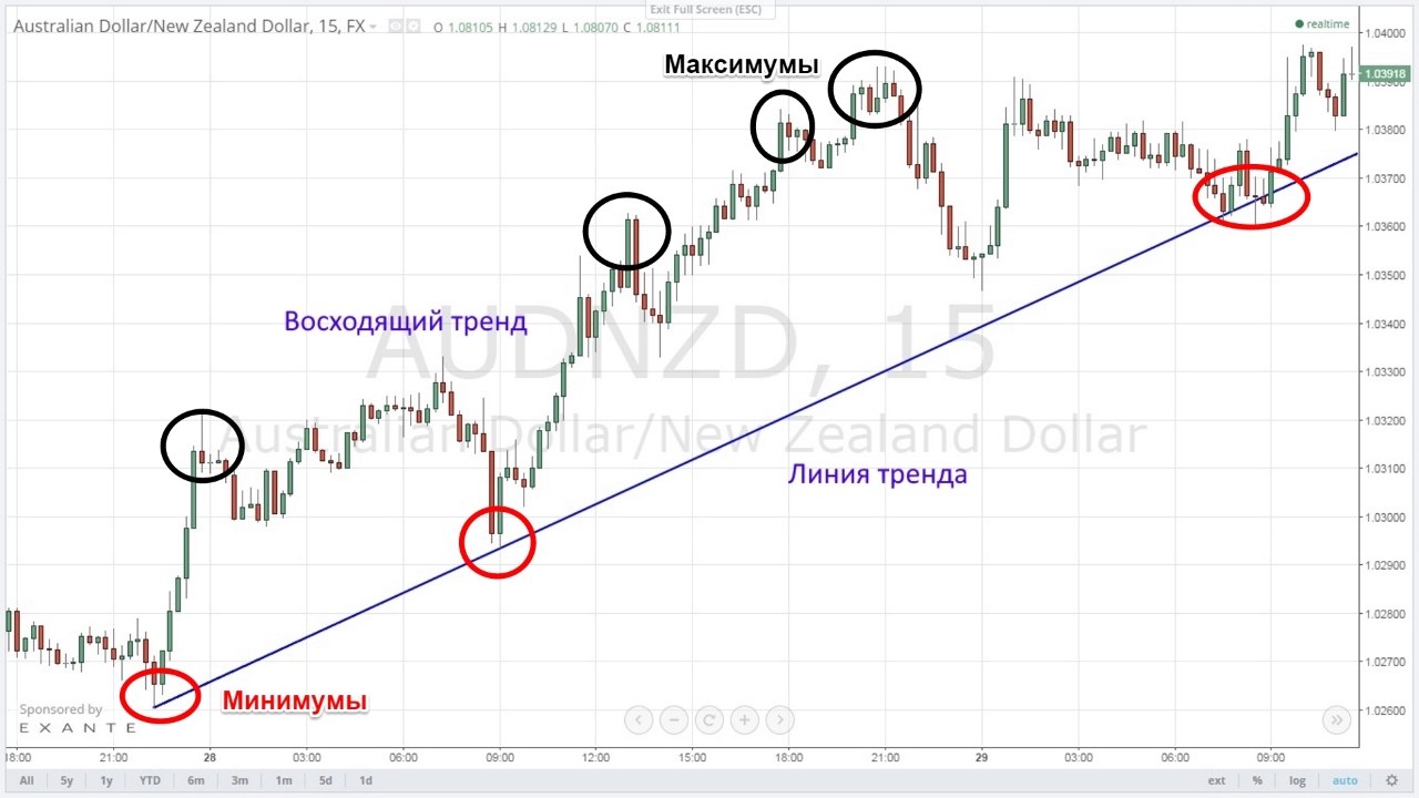
If the uptrend failed to overcome the last high and failed to reverse and pass the previous low, then a flat most likely began.
Downtrend - is formed by an alternation of local lows. Each next low must necessarily be lower than the previous one. There is also a series of highs, each next one lower than the previous. The inability of prices to break the previous low indicates a weakening of the trend movement and warns of its end. A rise above the last high suggests the beginning of a trend reversal.
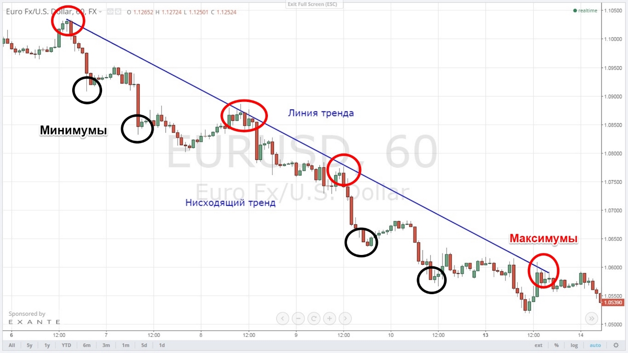
If the falling trend failed to overcome the last low and failed to reverse and pass the previous high, then a flat most likely began.
Depending on the presence or absence of a trend in the market, we may face the following tasks.
When a trend is present:
- To what price will the trend continue;
- To what price will the correction proceed without a trend change;
- Has the trend ended? Are there any signs? This is perhaps the most difficult part of technical analysis.
When a flat is present:
- The value corridor of the flat;
- Does the width of the flat range allow trades, and does it make sense to make trades at its boundaries?
Support and Resistance
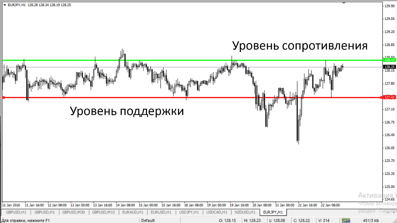
By observing the price chart, we can see certain points on it that can sometimes line up into areas. These points arise when the price reaches certain invisible areas, levels. The price may slow its movement when approaching these zones, and sometimes it rebounds from them and starts moving in the opposite direction. If such movements were observed on our chart earlier, then they will probably be observed further on as well.
Support level is commonly built using several local low points that we could observe earlier in the past. These points should be located within one horizontal price level. Support must necessarily be located on the chart below the current price of the trading instrument.
Resistance level is commonly built using several local high points that we could observe earlier in the past. These points should be located within one horizontal price level. Support must necessarily be located on the chart above the current price of the trading instrument.
Level Breakout
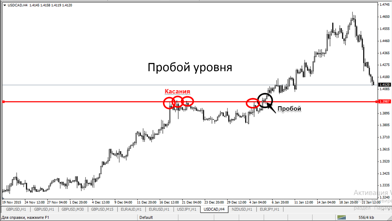
Level breakout is the overcoming of a level by price and consolidation beyond it. Often this event marks a trend change.
There will be many levels on the price chart, especially on lower timeframes. If a level is repeatedly tested by price movement, that is, it was built from at least three points, then its breakout has more substantial significance.
The inability to break through a level also increases its significance on the chart. In the presence of a trend, a strong level can be a sufficient obstacle for a correction or even a reversal of the trend in the opposite direction.
To identify a strong level, the rule of three touches of that level should be followed, ideally from different sides.
Patterns

Is it possible to determine that the trend has ended or is it still continuing? Let us try to use graphical reversal and continuation models.
Reversal models are rather subjective graphical patterns, the formation of which on the chart may mean a trend change. The most popular reversal models are:
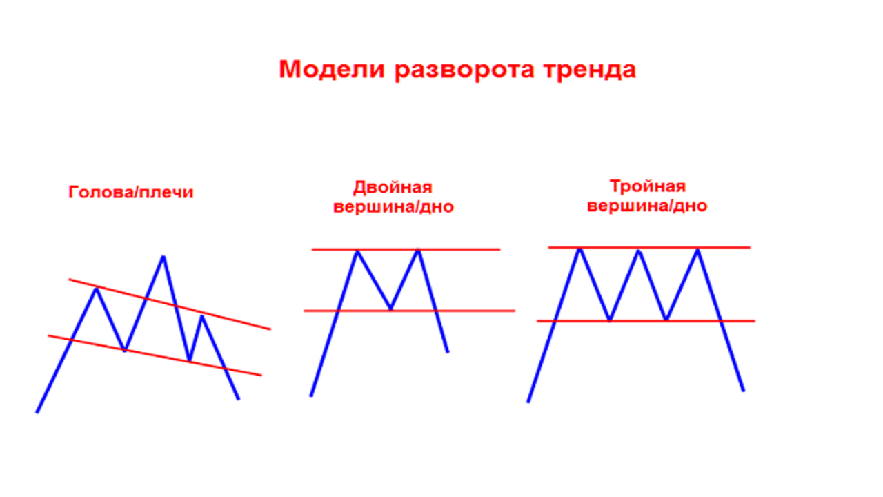
- double top ;
- triple top;
- head - shoulders;
- inverse head - shoulders;
- double bottom;
- triple bottom.

All reversal models are conceptually similar to each other if we consider them as a concept of market behavior.
Continuation models are figures that are less subjective relative to reversal models, the formation of which on the chart means the probable continuation of the trend.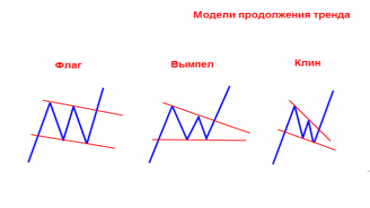
Popular continuation models are:
- types of triangles ;
- flag;
- wedge;
- pennant.

Indicators

With the development of computing technology, an internal auxiliary branch emerged within technical analysis: technical analysis indicators.
Graphical technical analysis is the first phase of technical analysis that arose before the development of computer technology. Charts were drawn manually on graph paper. Traders were limited to the simplest visual analysis of charts. With the development of computing technology, it became possible to analyze price movement using mathematical indicators and, to a greater extent, to demonstrate the mood of market participants. Despite this, indicator-based technical analysis could not displace graphical technical analysis. Both of these types of technical analysis are used by traders everywhere.


There is also a third, rarer type of indicator that analyzes volume.
There is no universal indicator for everything. Therefore, most trading strategies are usually based on two or three indicators.
Conclusion

Technical analysis is undoubtedly one of the two most important directions of market analysis. When trading with technical analysis, you must by no means forget about the fundamental side.
In today's lesson, we looked at the main directions for studying basic technical analysis. For each of these directions, you can find more detailed lessons on our website.
Sincerely, Alexey Vergunov TradeLikeaPro.ru