
Point-and-Figure Charts in Price Action Strategies

Hello, fellow traders!
Among the many theories of market analysis, traders often prefer Price Action. Strategies based on visual observation of price movement make it possible to avoid signal lag, which technical indicators often suffer from.
However, nothing in our world is perfect, and this method has its weak sides. This problem can be solved with Point-and-Figure charts. Surely many of you have heard of them and even seen them, but never used these charts in practice. Well, let us fill this gap.
The common problems of Price Action are known to both beginners and professionals:
Surely each of us can continue this list by adding problems from personal observations and experience. In the Forex market, there is a simple way to solve them by abandoning candles and switching to displaying the chart in the form of point-and-figure charts.
X0 – Price Action from the depths of time

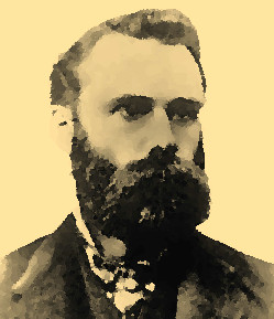
Point-and-figure charts became widespread in Western trading much earlier than candles. In 1901, this method of analysis was called "book-based" at the suggestion of Charles Dow, the pioneer theorist of technical and fundamental analysis. Traders drew these figures on graph paper as early as the end of the 19th century.
It is quite logical to conclude that Price Action was the only theory a century and a half ago: the peculiarity of displaying price with binary code did not allow the use of technical indicators; these were one-dimensional charts that did not contain a time indicator.
How does a cross appear, where does a zero come from?

In the 19th century, the value of securities was tracked according to the card-account principle, putting a cross when the price rose by a specified number of points, and a zero when it fell. Investors were not interested in the market situation until the stock price exceeded a certain threshold.
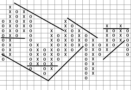
The marking was done on graph paper, each cell of which was equal to the number of points of a cross (in the case of growth) or a zero (in the case of decline). If you take a step of 10 points for a currency pair, the picture of price fluctuations looked approximately like this:
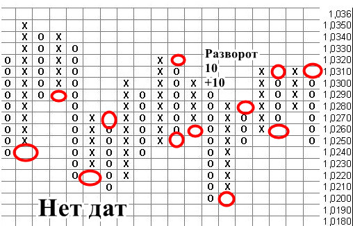
Please note the following features:
In the figure above, it can be seen that a column of zeros or crosses begins with an empty cell. This means that for the opposite movement to appear, the price must pass 20 points (10 pips - an empty cell + 10 pips - the threshold for the figure to appear).
The two described conditions of cell size and the reversal rule of quotes freed 19th-century traders from the need to write prices into dates; they were usually written below after the completion of the formation of the next column.
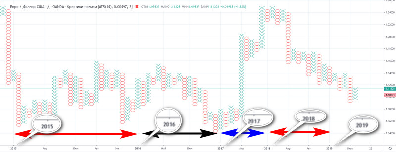
If you apply time to such a chart, you get the following picture: the intervals between years will be distributed unevenly; this depends on the long-term nature of the trend, which is shown by the length of the column.
The obvious benefits of point-and-figure theory

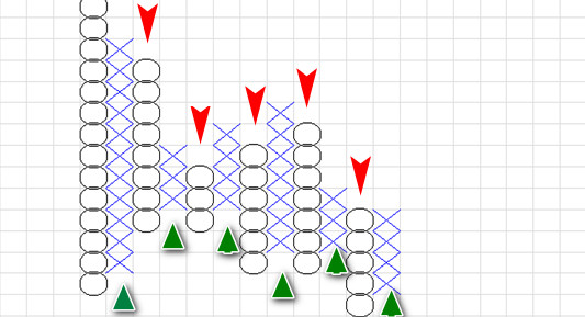
Point-and-figure charts are an ideal model for getting acquainted with Price Action theory, understandable to every beginner because of the minimal number of settings. It is enough to set the cell size and reversal rules (two or three cells), and the trader will get a simple signal system for countertrend trading:
Another obvious benefit is the unambiguity of the rules for building and breaking lines. Since the cells are square, sloping price channels will always have the same angle. Horizontal resistance levels are drawn according to the same rules as for candles, seeking to include the maximum number of crosses and zeros and ignoring deviations.
Forex X0 – principles of chart construction

The point-and-figure strategy (XO) must be adapted for work in the Forex market. The problem of analyzing currency pairs lies in sensitivity to volatility when building XO and the relative accuracy of entry, given the principle of cell formation (the price must pass a certain number of points).
TradingView developers solved the listed problems with the help of the following rules:
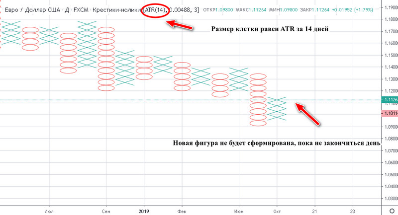
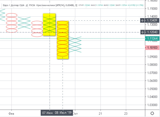
The scale of days at the bottom of the chart marks the beginning of the formation of a new column. In the figure below, it can be seen that the bullish "cross trend" began on June 7 and ended only a month later on July 8, when the first zero appeared, signaling a decline. During this time EURUSD managed to rise from 1,1204 to 1,1344 - a decent profit for one month.
X0 quotes in the TradingView service

The developers of the TradingView platform, which broadcasts online market quotes of many instruments, implemented the possibility of displaying them in the form of point-and-figure charts.
You can configure the corresponding chart type by entering the name of the currency pair in the search field on the site and choosing from the drop-down list:
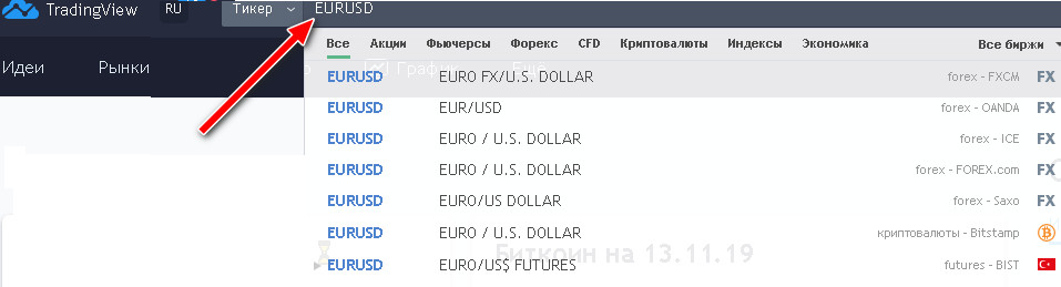
In the window that appears, choose the “Interactive chart” option.
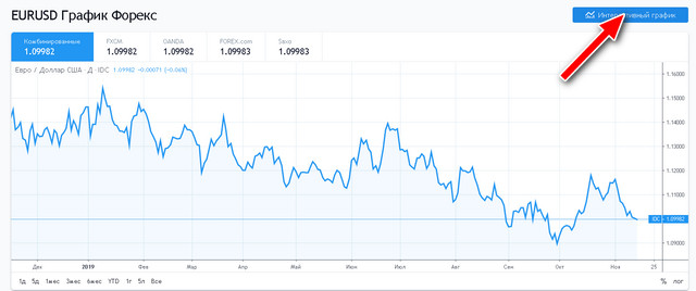
The trader will have access to a platform with a full set of tools for technical analysis. By default, the exchange rate is displayed in daily format, marked with the letter “D”, located to the left of the instrument name.
Even farther to the left there is a window with a list of quote types; click it and select the “Point-and-Figure” option from the drop-down list.
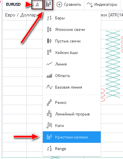
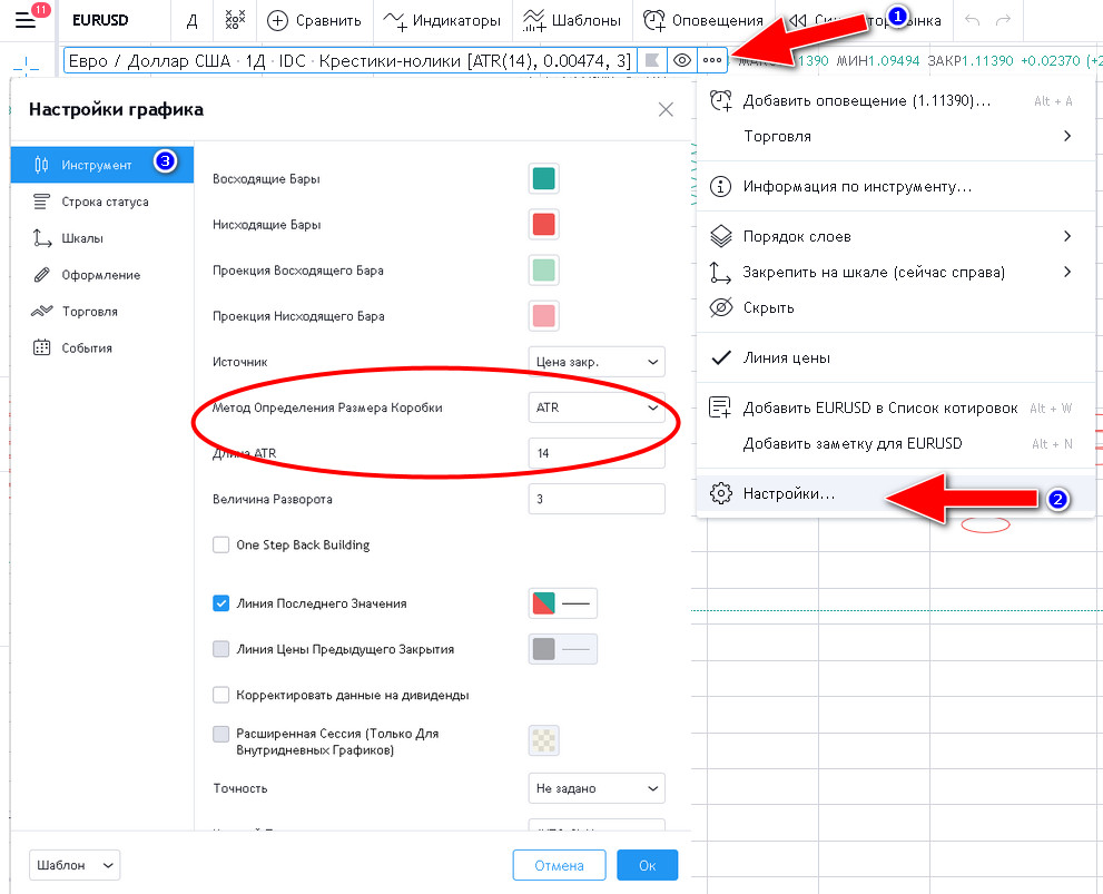
By default, the box size is set by ATR with a period value of 14, but the trader can change the settings independently by following steps 1, 2, and 3, as shown in the figure below:
Adaptation of Price Action patterns

Trading by Price Action patterns follows the classic rules set out in many articles on our site. It is only necessary to clarify the principles of constructing the patterns.
· Support and resistance levels
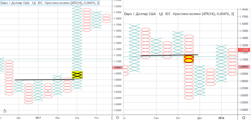
The lines are drawn so that there is no more than one zero below them and no more than one cross above them. If the condition is violated, the level is redrawn.
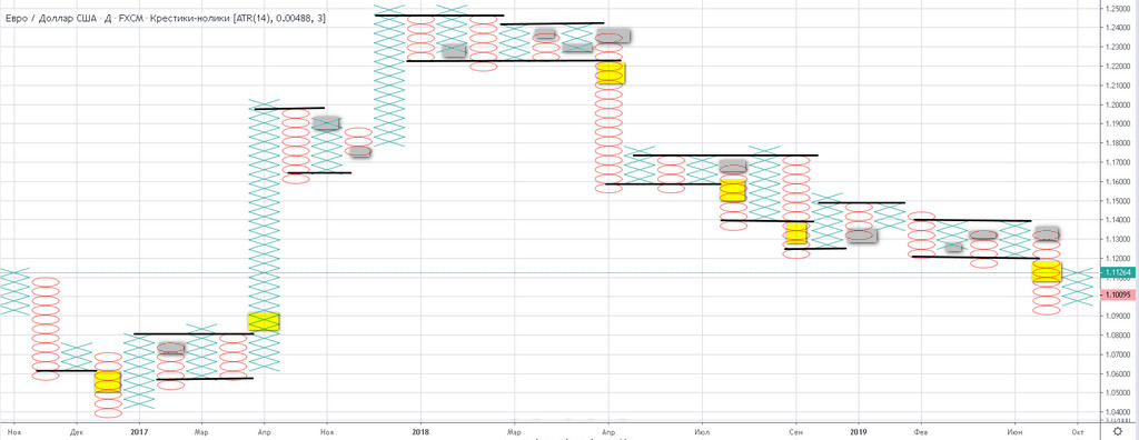
By following such construction rules, the trader will easily determine a breakout and a rebound.
As soon as two crosses appear above the line, this is a signal that quotes are leaving the flat in the upward direction. Two zeros below are a signal for quotes to fall. The first cross above support is a rebound upward from the level, and a zero below resistance is a bounce downward.
· Price channels and sloping levels
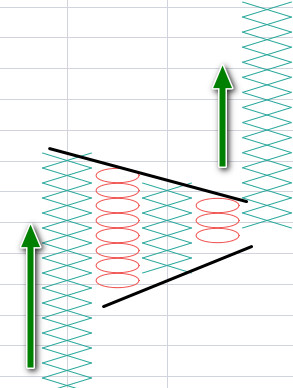
The construction of price channels and sloping levels is done only by the maximum values of crosses for the upper boundary and the minimum values of zeros for the lower boundary. The rules for breaking triangles and trend zones are similar to those given above: two crosses or two zeros above the resistance/support lines.
Pay special attention to how perfectly the most complex figures of technical analysis, triangles, are formed and worked out.
In the figure below, you can see how oscillations fade out: the number of crosses and zeros decreases by exactly one with each reversal column. This is a frequent XO pattern: when three crosses/zeros form at the end of a triangle, we expect an impulse breakout.
· Three crosses/three zeros
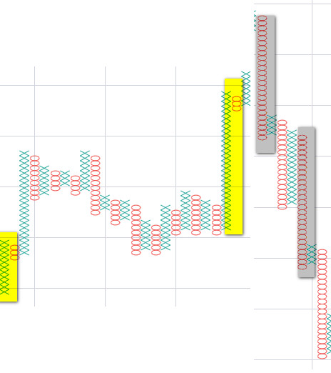
If after a long column with more than ten crosses only three correction zeros appear, one can expect the trend to continue.
There are similar rules for a falling “zero” downward movement: three rebound crosses upward after a long column of zeros are a frequent sign of a subsequent prolonged decline.
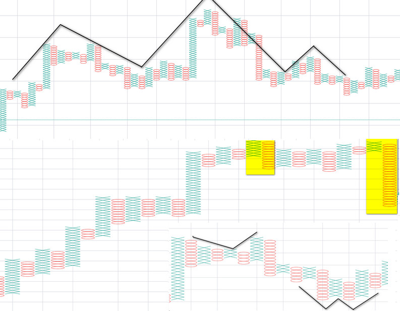
Common candlestick-analysis figures work on XO: reversal candles, double and triple tops, head/shoulders patterns, and so on.
Strategy money management
The task of point-and-figure charts is to simplify finding and using Price Action patterns, so the rules of money management will not be anything new; stop losses and take profits are already described on the pages of articles about the corresponding patterns.
Among the features of limiting loss, the following can be highlighted:
Count the number of zeros and crosses horizontally and multiply by three. In our case, we got 4; let us multiply this number by three and wait for 12 crosses to appear after the triangle breaks upward. We will lock in profit as soon as the last figure in sequence closes.
A special feature of crosses and zeros is the fact that a new column is drawn only after a pullback in quotes by the threshold value of two cells.
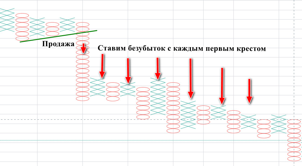
The tops of columns of zeros in a falling trend and each base of rows of crosses in rising quotes can become points for trailing stops. When following all the above advice, one should remember that the figures are drawn by a step-by-step strategy. They appear at the end of the day, without taking into account tails, that is, the maximum and minimum intraday changes that can knock out stops.
Conclusion

The picture below shows 8 years of EURUSD rate fluctuations in the form of daily candles and point-and-figure charts. They are identical, which clearly demonstrates the absence of trend distortion when using the simplified XO analysis approach.
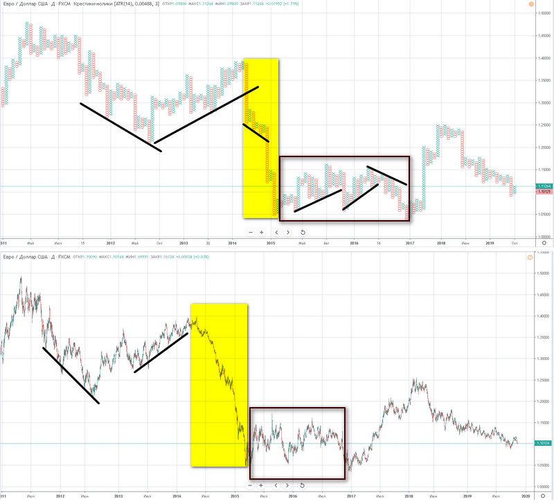
Thanks to the filter of volatility, point-and-figure charts identify microtrends better in a prolonged wide flat area, where many traders, especially beginners, incur losses. To finally make sure of the strategy's effectiveness, try reformatting familiar patterns from candles into XO. Perhaps many areas that previously raised doubts will become clearer, and the signals unambiguous.
Respectfully, Ivan Petrov
Tlap.io
