
Graphical Analysis in Forex - what is it?

As is well known, about 90% of information about the surrounding world is received through vision. At the same time, an enormous amount of work to correct errors at different levels of perception is carried out on a subconscious level, and what we become aware of is an already processed body of data. In some cases, this can lead to a distortion of the true picture of reality. Therefore, training perception is extremely important if solving a task depends on conclusions drawn from the visual images received.
In the Forex market, there is such a concept as Graphical Analysis. Graphical analysis is the interpretation of information on a chart in the form of graphical formations and the identification of recurring patterns in them, with the aim of making a profit.
When moving on to market analysis, it is necessary to understand that, unlike a purely technical approach, graphical analysis does not give us a complete answer to the question of how and what to do. First of all, this is due to the presence of more complex theoretical models, in some cases imperfect and possessing certain inaccuracies. For this reason, automating the search for graphical patterns is a much more extensive task and creates that very fine boundary between technical and graphical analysis.
Therefore, it is important to use the right tools in your work. In itself, the use of external tools contributes to objective perception and frees us from most erroneous initial conclusions made on the basis of emotions. Thus, when it comes to graphical analysis, one must never rely entirely on one's own perception and must always confirm decisions with additional measurements.
How Graphical Analysis Works

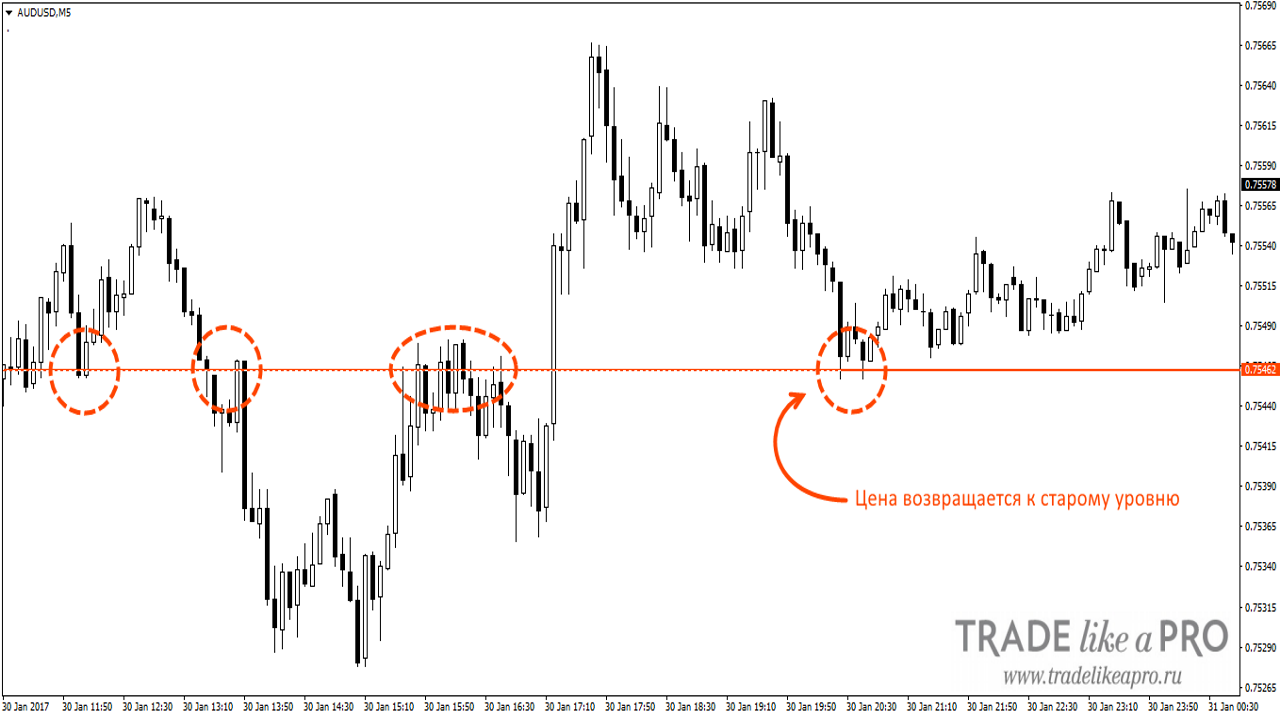
As with any other technical tool, graphical analysis is faced with the task of finding patterns in historical data. The simplest example is a trading level. If we draw a horizontal line in places where price is most concentrated, we will see characteristic movements near our level, as if the price is "testing" it, not having enough strength to break through the level and move farther.
The circles on the chart mark rebounds from the level. By marking such moments, we can assume that in the future the price will also rebound from the level. That is, we have found a pattern. Naturally, you cannot trade this way blindly, because we do not know when the price will actually rebound from the level and when it will break through it. But we can certainly use it as part of an objective view of the market.
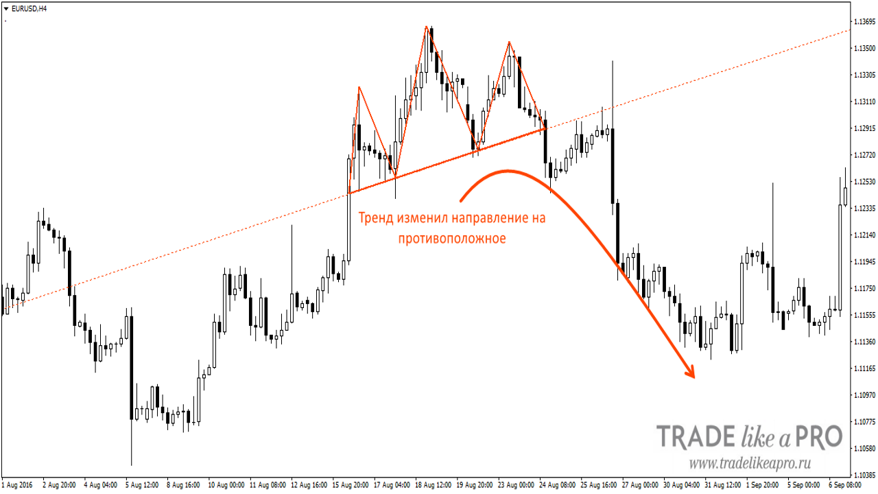
The same applies to any other figures of graphical analysis. We find a figure and check how the market reacted to it in the past and what trend followed it. For example, it is commonly believed that the "Head and Shoulders" figure indicates a reversal of the trend. Therefore, when we find such a figure on the chart, we assume that the price will reverse and move in the opposite direction.
There are many varieties of figures, as well as many ways to identify them. Some prefer simpler graphical patterns and candlestick models. Some use the golden ratio coefficient, building so-called harmonic patterns and identifying reversal points with the help of Fibonacci lines. The principle is the same in all cases.
From all this, we can conclude that graphical analysis is not a precise tool and is largely tied to the subjective perception of an individual trader. This is partly true, and there are even developments that attempt to confirm or refute this statement.
One such development is the DejaVu indicator, which builds a forecast by analyzing segments of historical data from the past. The starting point is the section between two vertical lines (the red dashed lines on the chart). With the help of the Pearson correlation coefficient (Pearson CC), the indicator finds similar sections in the historical data and, when there is a high correlation, makes a corresponding forecast of future movement.
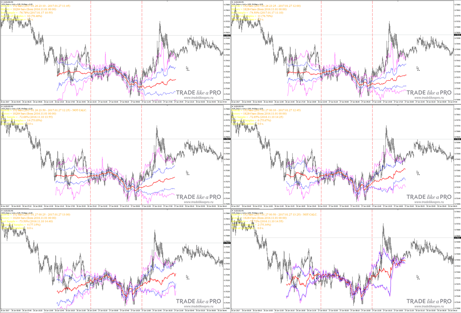
This example clearly shows how the quantity and quality of input data can affect the final forecast. It is enough to shift the window a little for the forecast to change dramatically. Therefore, it would be more illustrative to analyze the quality of individual figures, which is the subject of a separate study.
Basic Figures

Let us consider the existing figures and the ways to identify them. The main graphical skeletons are the triangle and the channel.
- Triangle
There are two main types of triangles: expanding and converging. An expanding triangle is a characteristic wave-like movement in which each successive swing is larger than the previous one.
A converging triangle, on the contrary, is formed when the levels of support and resistance gradually move closer together.
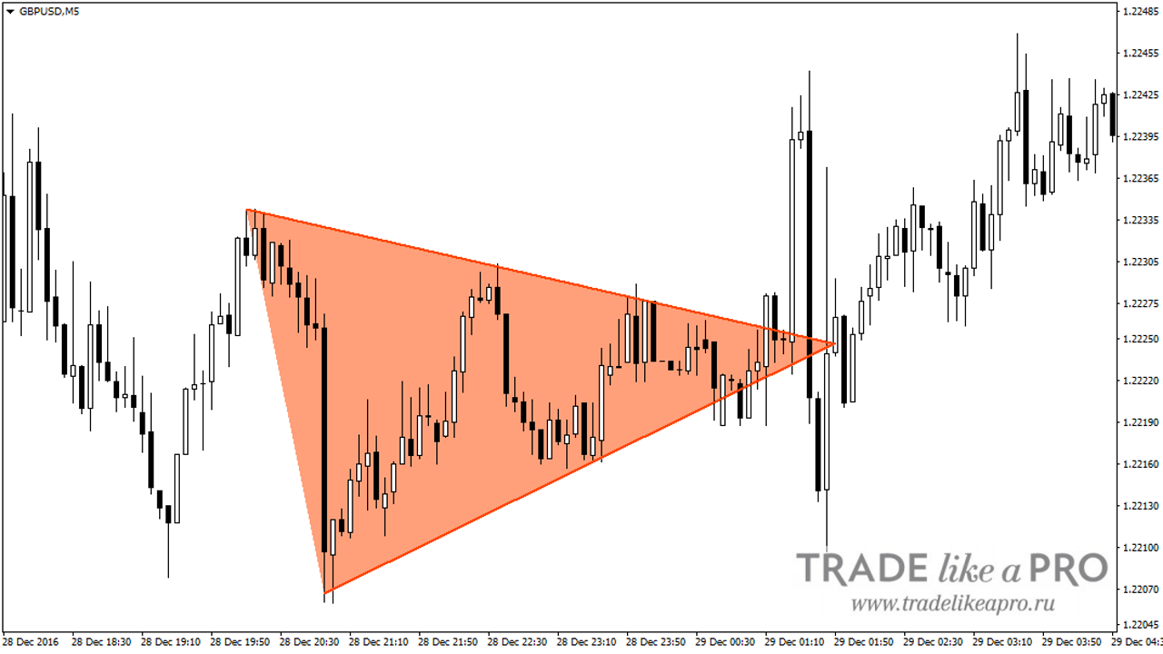
The moment to enter a trade is the breakout of the boundaries formed by the graphical figure.
Further, such a triangle can be divided into ascending and descending. In the first case, we are dealing with a horizontal resistance level and a rising support level. It is worth entering a trade when the resistance level is broken. In the second case, on the contrary, we have a static support level and a descending resistance level. Accordingly, a trade should be entered when the support level is broken.
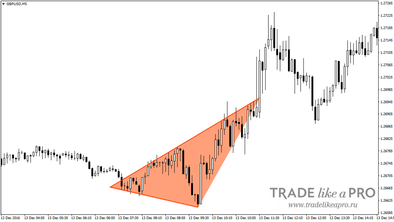
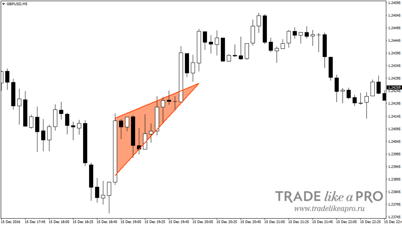
The figures "Rising Wedge" and "Falling Wedge" can also be included here. It looks approximately like this.
In this case, we are dealing with converging support and resistance lines moving in the same direction; they form a kind of triangle with a very sharp angle.
- Channel
A channel is a horizontal movement of price between two parallel lines. A horizontal price channel is also called a "flat". That is, if the price is moving in a horizontal channel, we can say that the market is in a flat.
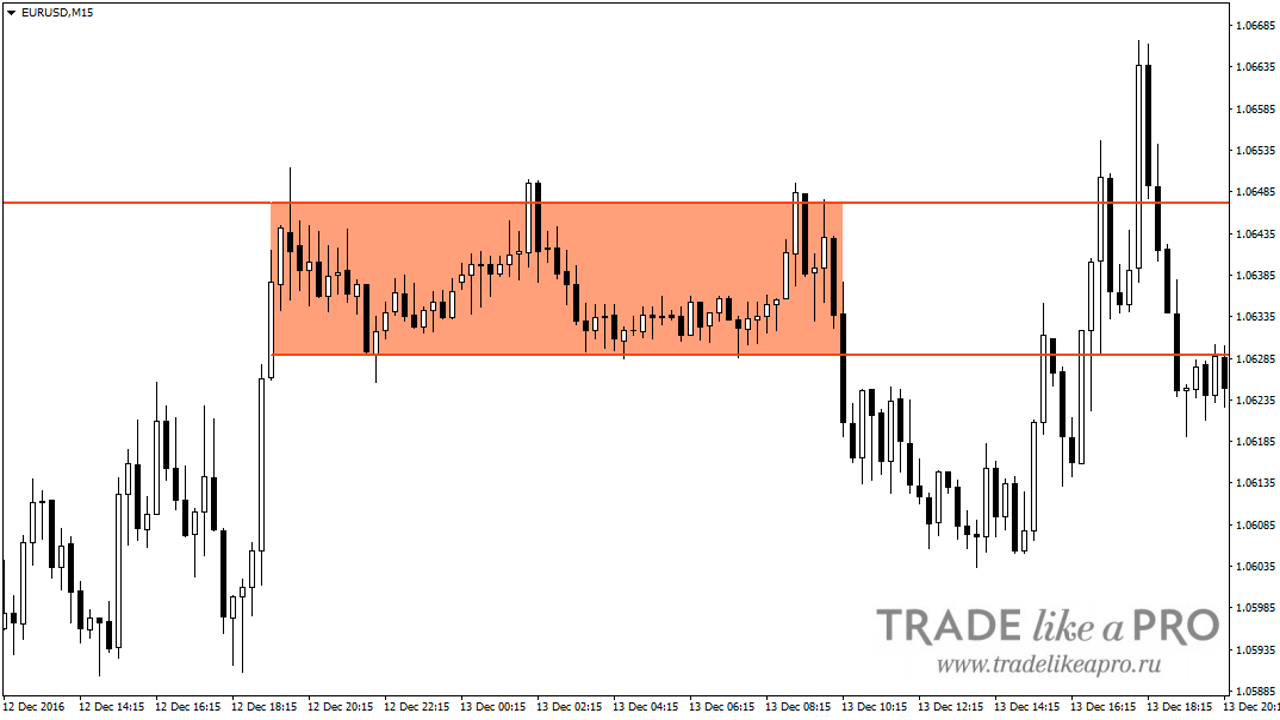
A sloping channel may already indicate a trending movement. At the same time, the greater the angle of slope, the stronger the movement.
A more specific example is the double top or double bottom pattern. As the name suggests, a double top is a channel formed by two consecutive tops and one minimum. A double bottom is a channel formed by two consecutive minima and one maximum.
The number of consecutive maxima and minima does not necessarily have to be two. There may well be three or more. In that case, we will be dealing with a triple top or a triple bottom.
Since these are reversal patterns, their consequence is a trend reversal. Entry should be made on a breakout of the lower level in the case of a double top and of the upper level in the case of a double bottom.
Conclusion

Despite decades of research by professional traders, the topic of graphical analysis has still not been fully explored. Existing figures, although they are often encountered in the market, do not have uniform construction rules, which means that a certain degree of subjectivity is present in the analysis in any case.
Formalizing clear rules and then testing patterns in practice is what one should really begin one's own research with.
Respectfully, Alexey Vergunov TradeLikeaPro.ru